Flagg
Add summary here.
Team
All me plus some feedback from my mentor.
Role
UX/UI + Branding
Duration
3 month
Motivation
The Long Story: Dating apps are overwhelming and disappointing; users have a hard time gauging what their matches want long term (or short term!) and waste time discovering that we were never compatible on key values after many dates.
The Short Story: My friends actively use dating apps and one was horrified to find out her date had a criminal record; could I build a more transparent experience?
Solution
Dating apps are overwhelming and disappointing; users have a hard time gauging what their matches want long term (or short term!) and waste time discovering that they were not compatible on key values after many dates.
My Process
Research + Data
Primary Research – Survey – Interviews – Affinity Mapping – Persona – Problem Statement
Primary Research
I conducted primary research to get a general understanding of dating app users and the dating app market.
single people are looking for or have met dates online.
million people have used online services for dating.
million of these people have used an app based platform.
years is the average age dating app users.
of online users as of January 2019 were looking for an exclusive partner
Screener Survey + Interviews
With a growing dating app user base, I used a screener survey capture its high-level pain-points and interviews to go more in depth.
The screener survey...
- focused on two topics: user safety and motivations for using dating apps
- was taken by 30+ participants
- identified 5 survey takers for interviews
The interviews...
- topics focused again on the two subjects in the survey but also further explored what these users value when viewing a matches profile
- asked the biggest question: what feature would be on your dream dating app?
Felicia
“I would like to be able to interact with others based on mutual viewpoints. It would need to make people feel comfortable. I would like to see more nuance or talk of boundaries.”

Liam
“Unlimited choices are overwhelming. A selection allows me to focus on the profile, not just swipe hot-or-not. A selection feels like less of a hookup app.
Abby
“It is important to me to be matched with the same view points (eg. religion) and by interpersonal options; mine are someone who is always learning and values knowledge.”

Greg
“I am interested in what values the person has. I personally value selflessness, communication, open mindedness, shared common interests.”

Greta
“When it comes to STDs and sexual health. Someone not willing to have safe sex is a deal breaker. I wish there was more sex positivity on dating apps and safe sex was easier to discuss.”
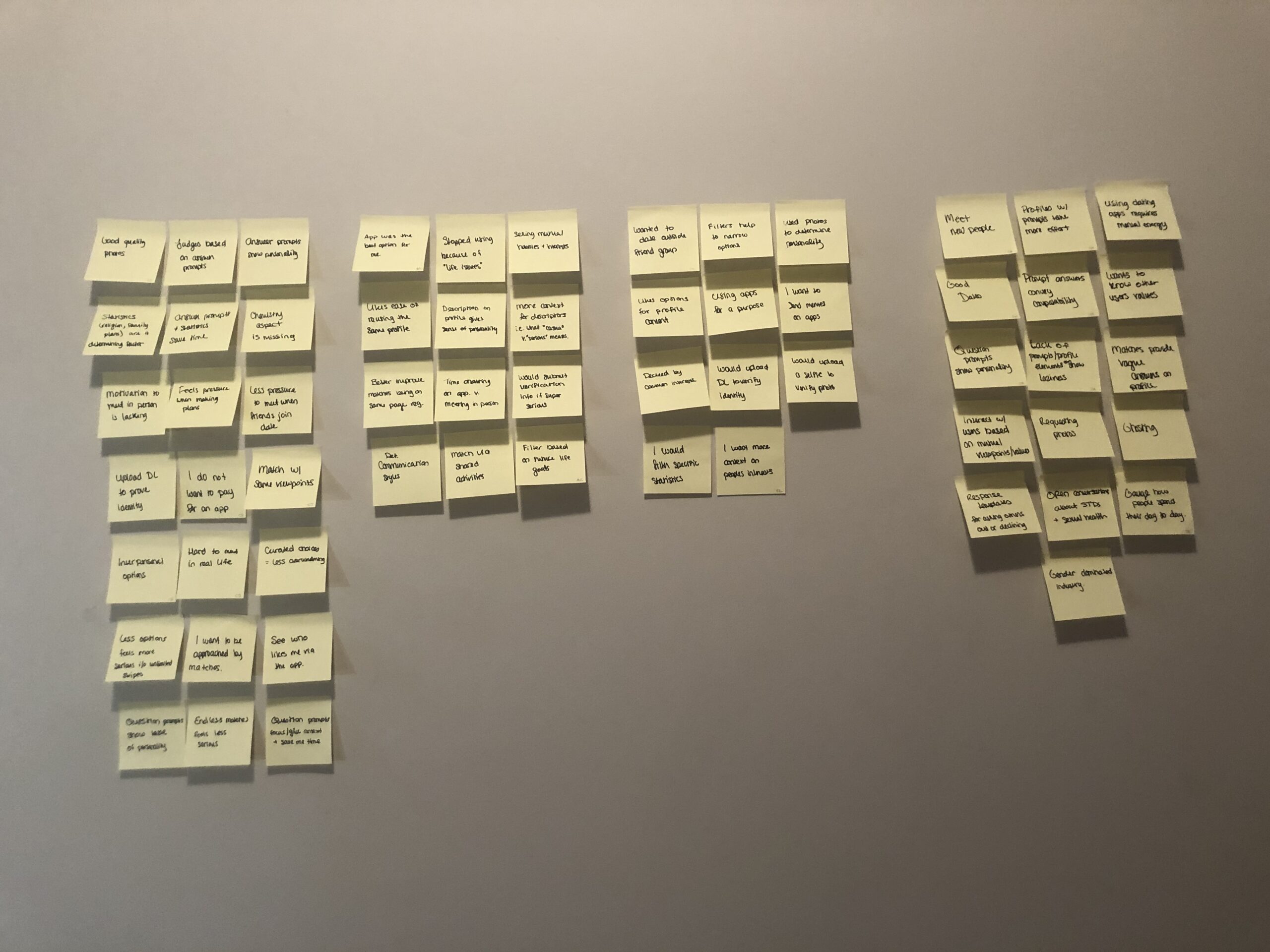
Affinity Map
After interviewing the candidates, I created an affinity map to summize the various painpoints.
Persona
To create a representation of dating app users, I developed Jordan so I could reference her/they for the final solution.

Jordan
Age: 28
Profession: Graphic Designer
City: Brooklyn, NY
Education: College
Jordan considers herself to be social and uses dating apps to find dates. She is confident in herself and knows what she wants in a partner. However, Jordan is tired of wasting her time getting to know and meeting up with people who do not share their unique values. Jordan wants a streamlined method to filter out people that she’s confident will not be a good match.
Values
Ethically single and searching for partner(s)
Certain of her core beliefs and has a general idea of what she wants in a partner
Hobbies
Spin classes on ClassPass
Weekend brunch with friends
Gallery openings
Tech
Likes new apps and gadgets but doesn’t like spending time learning how to use them
No cable, just streaming services
So how can we help daters like Jordan?
How might we allow users to determine common values between themselves and their matches?
How might we connect users more efficiently on an online dating app?
How might we allow users to give more context in their dating profile statistics?
Ideation and design
Sketches – User Flows – High-Fi Mockups – Style Guide
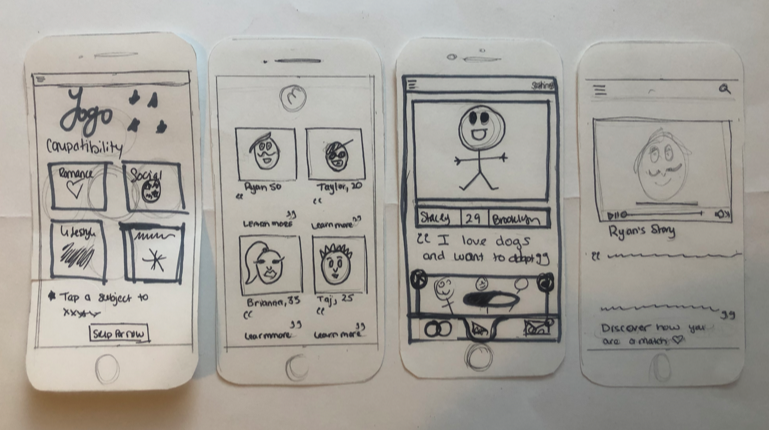
Sketches
My 1st ideations started with how to organize the user’s information. All the interview candidates stated that photos and basic statistics (i.e. age and location) were necessary; my challenge was also to include information showing the deeper values of their potential matches.
User Flows
My sketches filtered into the key journeys my user would take during their experience.
User bios & preferences
The section where users enter their information such as age, height, and photos while also setting preferences for their ideal match.
Compatibility Quiz
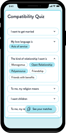
Here, users answer questions about what kind of dates they want to be matched with so the app can suggest the most compatible matches.
Profiles
The main screens the user will see during their first and continual use. These screens are where the user will view, interact, and communicate with their potential dates.
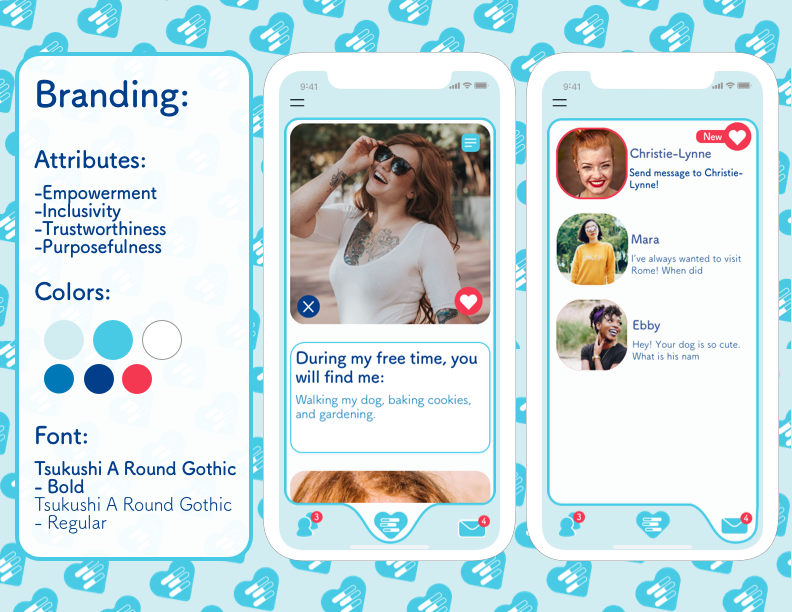
Branding
While the Flagg user is serious in their search, I wanted the interface to look fun, approachable, and slightly flirty. Warm blues, rounded shapes and edges, and a relaxed font style were chosen to accomplish this.
Prototyping & testing
Prototype – Usability Testing – Iterations
Prototyping
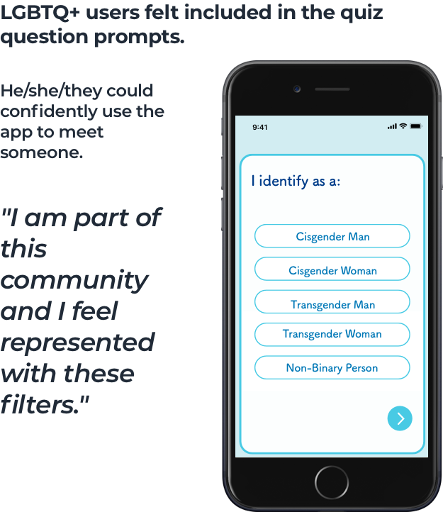
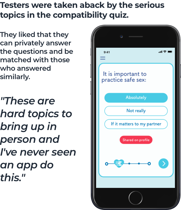
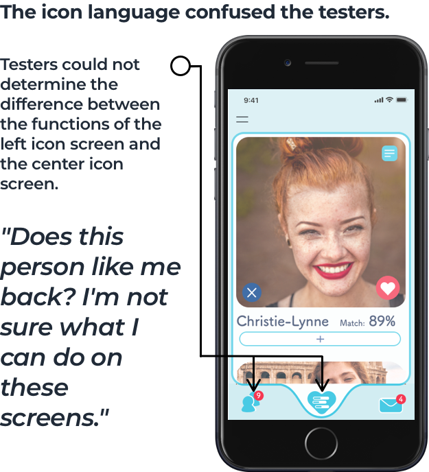
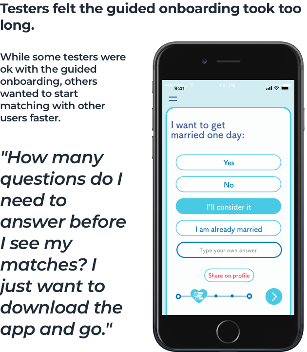
After building a prototype, I tested the high-fidelity red routes on 10 users.
The Good
The Bad
Final Iterations
Users were slowed down by the long onboarding process and couldn’t tell what the different footer icons meant.
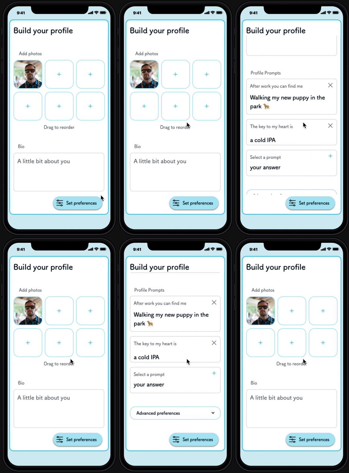
The new iteration has two main onboarding screens to build their profile with the power to customize it unique values. Additionally, the profile and suggested matches screen was redesigned to look different in order to convey different purposes when the user navagated between the icons.
Onboarding Part 1 - Statistics
The onboarding screens for the users basic information and photos were redesigned to be one simple form so the user knows exactly what effort is needed to build their profile.
Onboarding Part 2 - Compatibility Quiz
Here, users answer their chosen questions privately about their values so the app can suggest the most compatible matches. Users can update answers anytime.
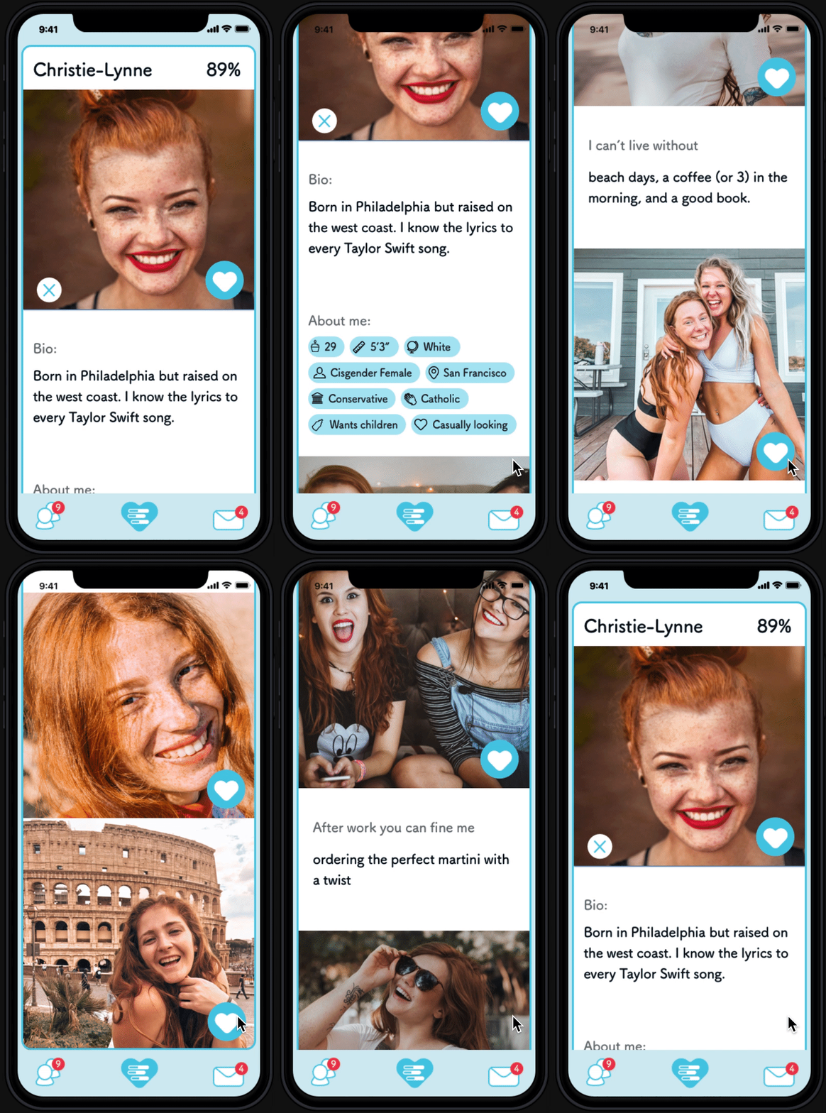
Profiles
The completed profile. This is the full profile a user will see of a potential match and how the user will appear to others.
Suggested Matches
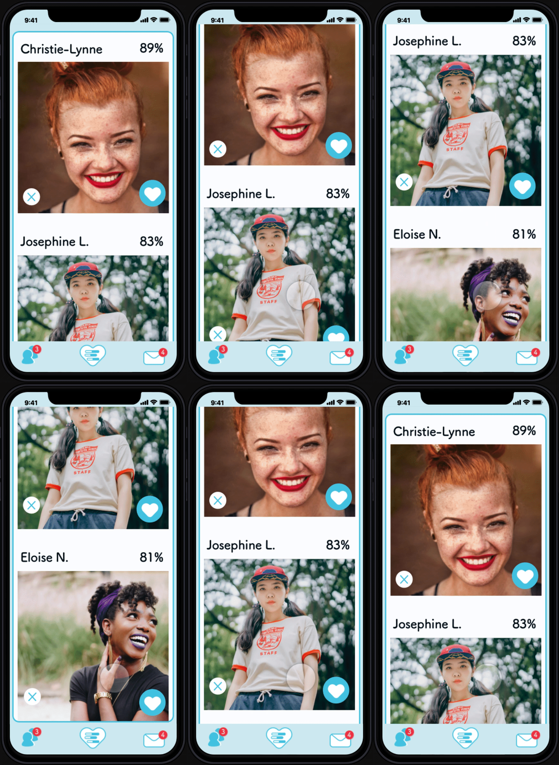
The suggested matches screen shows a photo and a percentage of compatability to spark interest.

Conclusion
Summary – Next Steps
Summary
Overall testers responded positively to the app; they loved it’s easy and simple interface, the blue colors, and felt confident that they could trust Flagg to suggest dates which match their values.
That being said, what can be improved?
The Next Steps
-
Test the new iteration to fine tune the improved onboarding and navigation between the features.
-
Optimize the compatability quiz with key interpersonal relationship traits by working with a relationship expert – I’m a UX designer, not a psychologist.
-
Build upon the messaging flows. Maching with a potential great date is useless unless they can contact eachother. This feature is ackoknowlege in the MVP but not yet tested.
NEXT…
