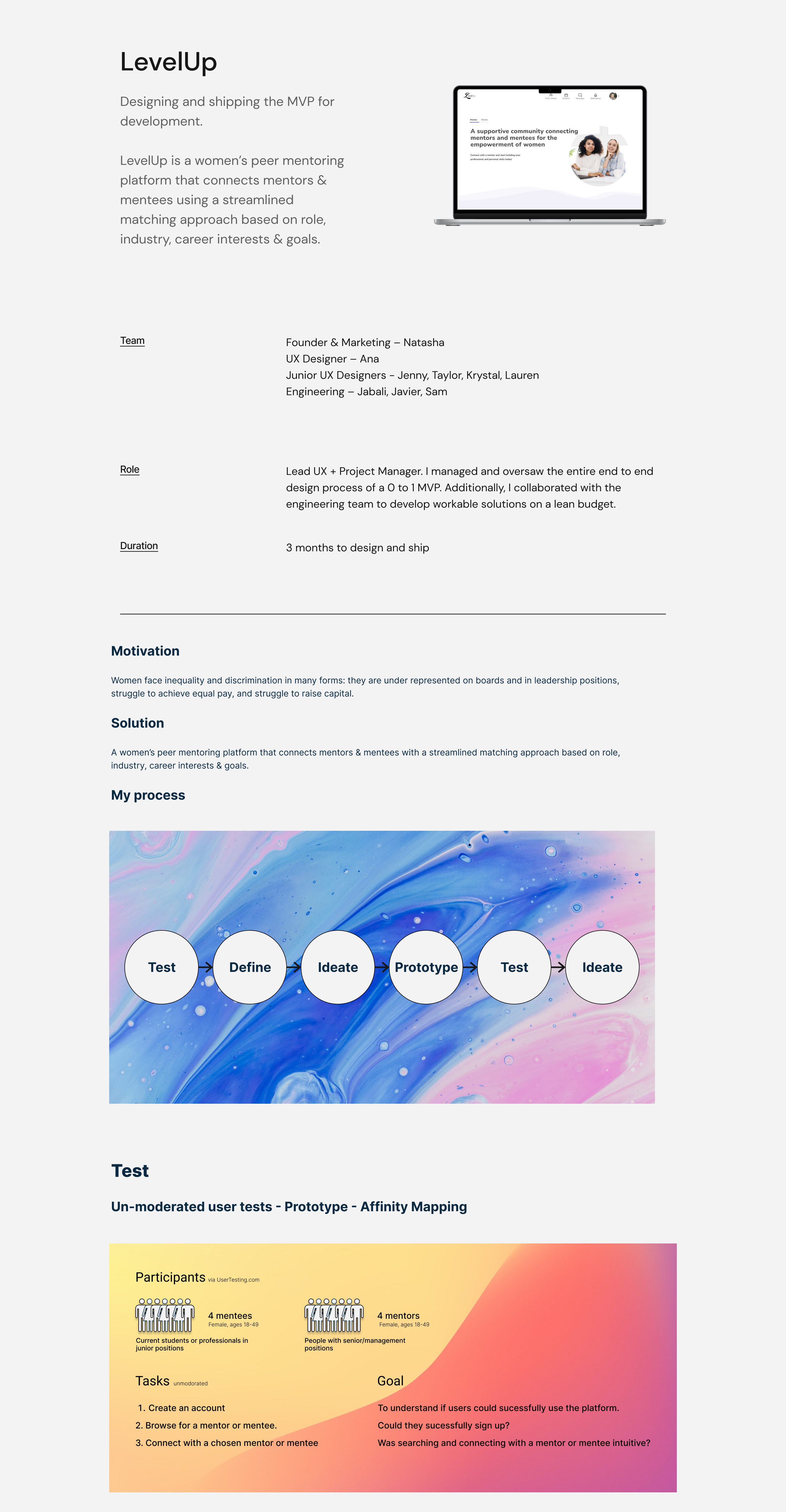
Prototype
Affinity mapping
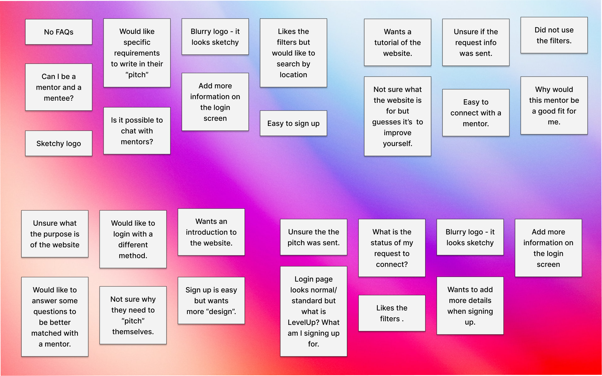
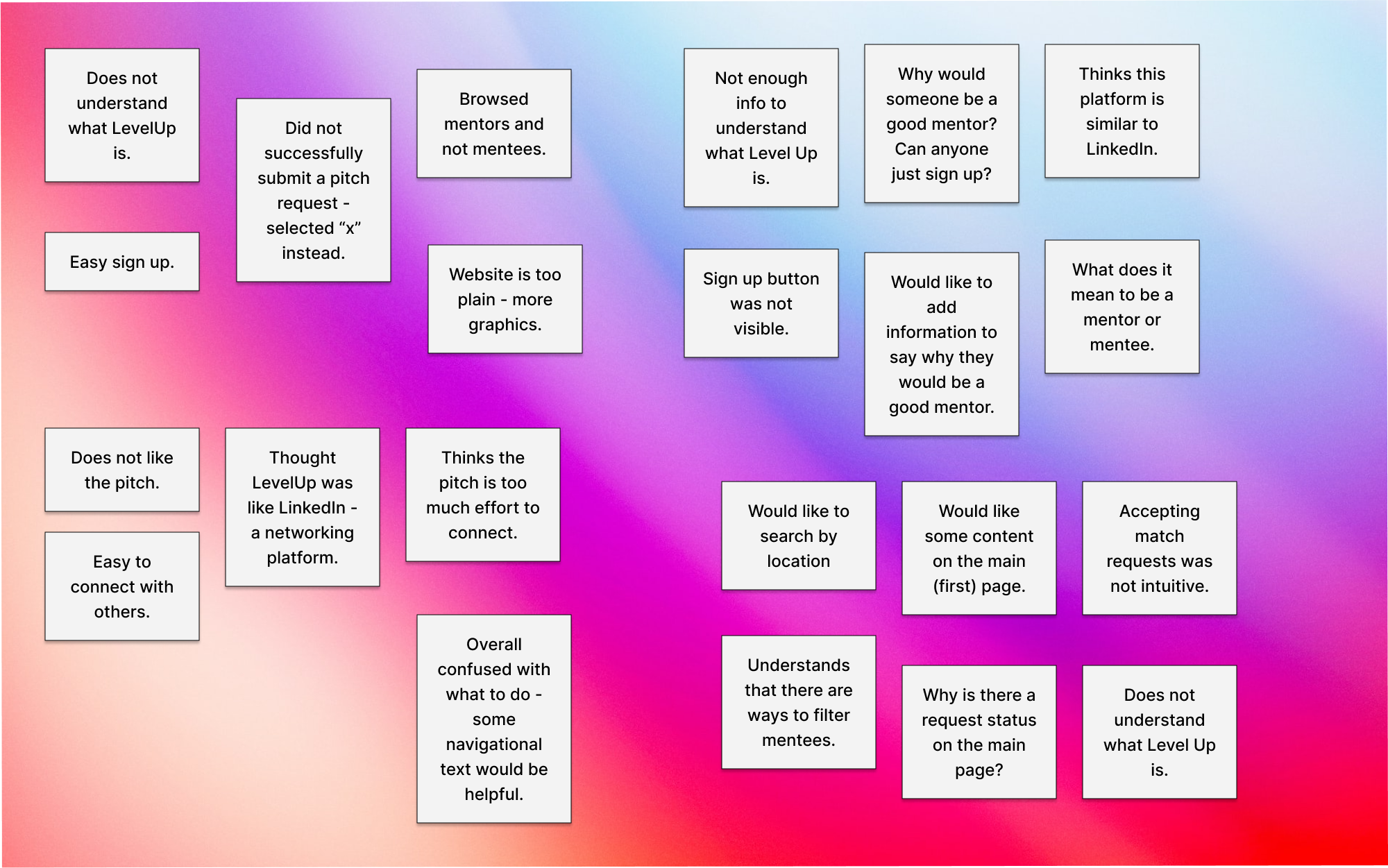
Pain point findings
What is LevelUp?
When the user enters the webapp, there is no clear explanation for what the user is signing up for and what Level Up is.
What do I do here?
Once and account is created, testers were unsure what actions to take on their dashboard.
Tasks such as searching for mentors and making a profile were not done with confidence because the interface was confusing.
"This looks creepy..."
The UI is not modern (on top of being confusing).
As one tester said “this looks creepy.”
Define
Solutions
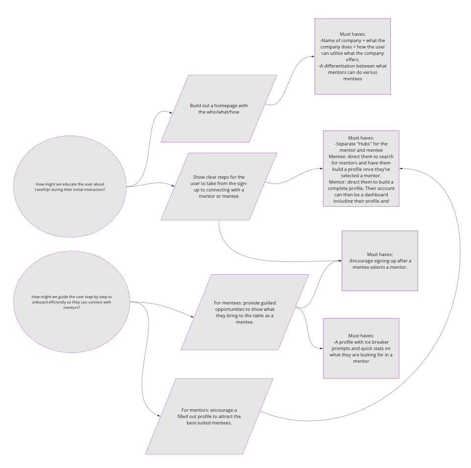
make a clear first impression?
Design a homepage that educates the user on LevelUp and it’s product offerings.
streamline the onboarding experience?
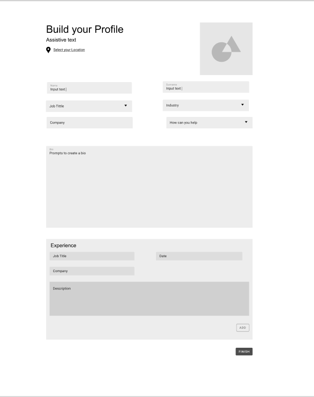
Mentors: Design a login journey that will encourage them to fill out a profile that’s attractive to mentees.
Mentee: Allow for a quick login process so that they can search for a mentor.*
*Currently, the webapp can only be used after account creation.
appear not creepy?
Use modern UI design to compliment the enhanced user experience.
Solutions
We decided the biggest problem to untangle was pain point #2.
How might we guide the user step-by-step to onboard efficiently so they can connect with mentors?
To start we built out a new and streamlined user flow which accounted for 4 different use cases.
2. A mentee logging into their account.
3. A mentor creating a new account.
4. A mentor logging into their account
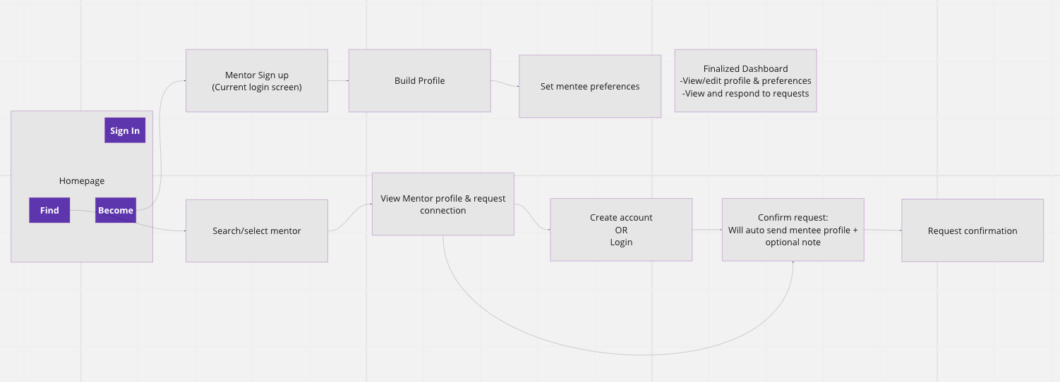
We felt that mentees should be able to explore mentors first in order to give them an incentive to sign up. In the new user journey, mentees are prompted to make an account or sign in when they decide to book a mentor session.
Mentor experience
A not too brief but not too labor intensive onboarding + profile creation would result in more people choosing to use the platform.
Our researched shows that the mentees consider many factors about a mentor before reaching out.
It was our job to encourage mentors to fill out their profile completely but also not overwhelm them with by asking for too much information.
Both
An account dashboard modeled after our better-known competitors would make LevelUp more intuitive to navigate.
Our first user test made it clear users were not sure what they could do once they made a LevelUp account – there weren’t many clear CTAs on the account dashboard.
We reviewed competitors (like ADP List) and other platforms that facilitated connections (like LinkedIn and Facebook) and determined what components were needed for an account dashboard.
Mentee experience
Mentees should have the ability to explore the LevelUp product before we ask them to make an account.*
We felt that mentees should be able to explore mentors first to give them an incentive to sign up. In the new user journey, mentees are prompted to make an account or sign in when they book a mentor session.
*The design team promised to validate this point because it would require a lot of work from our developers.
Ideate
Low fidelity wireframes
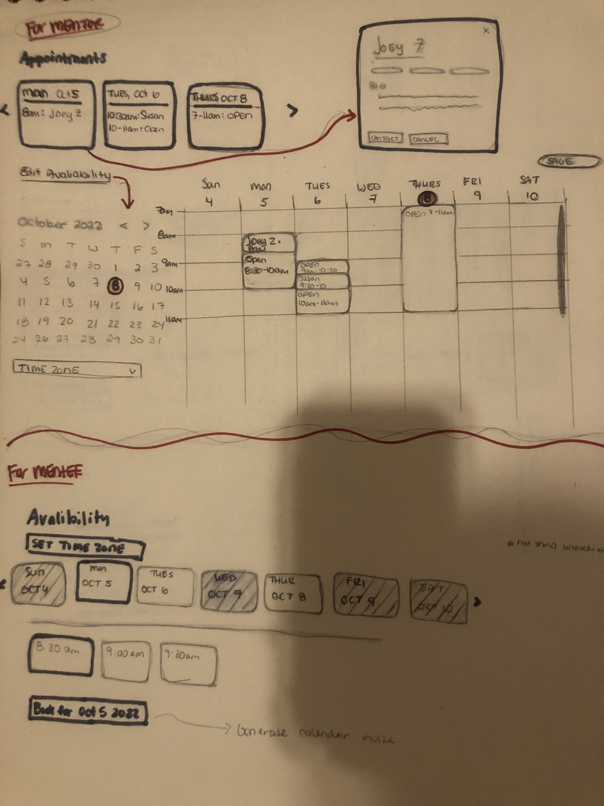
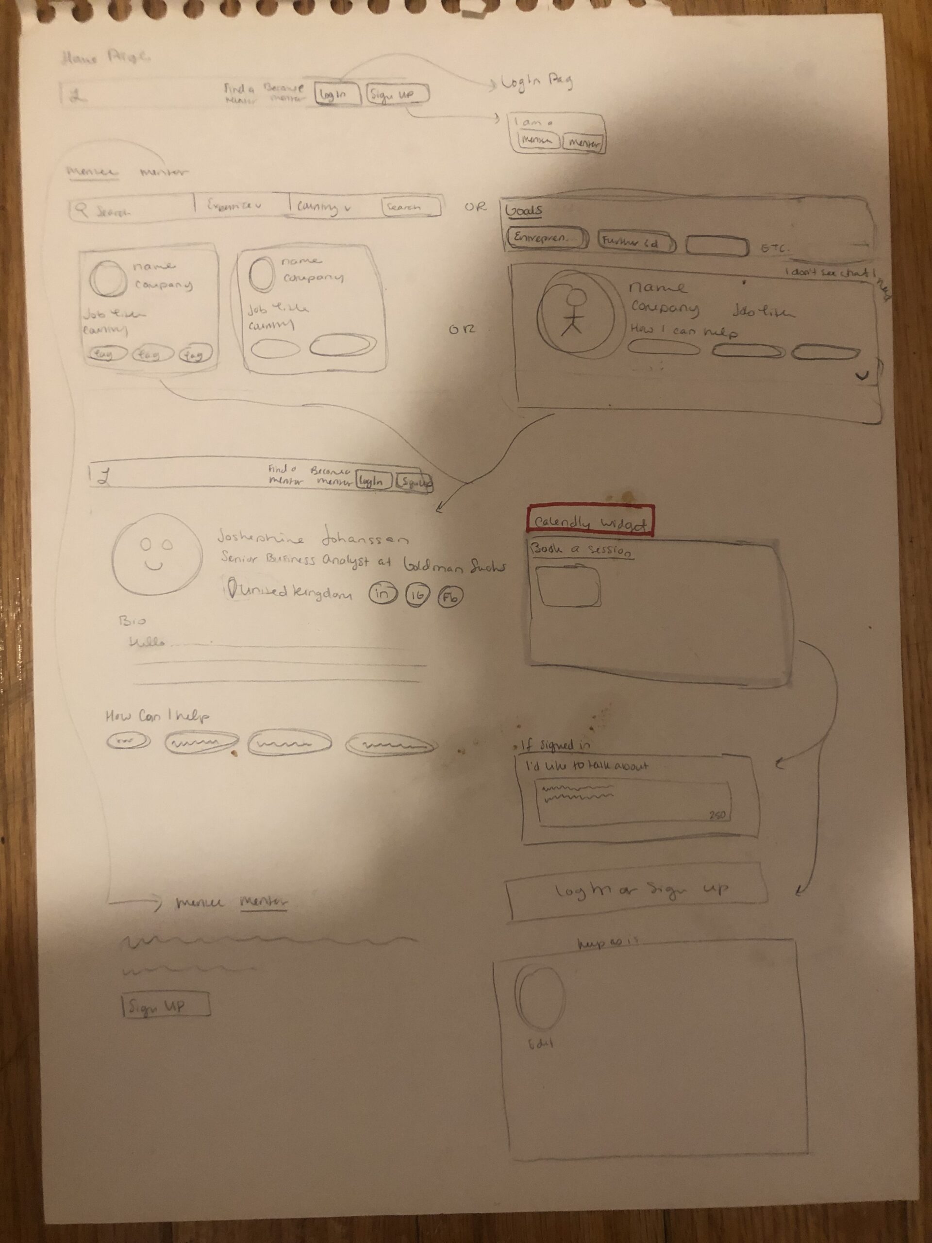
Wire frames
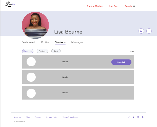

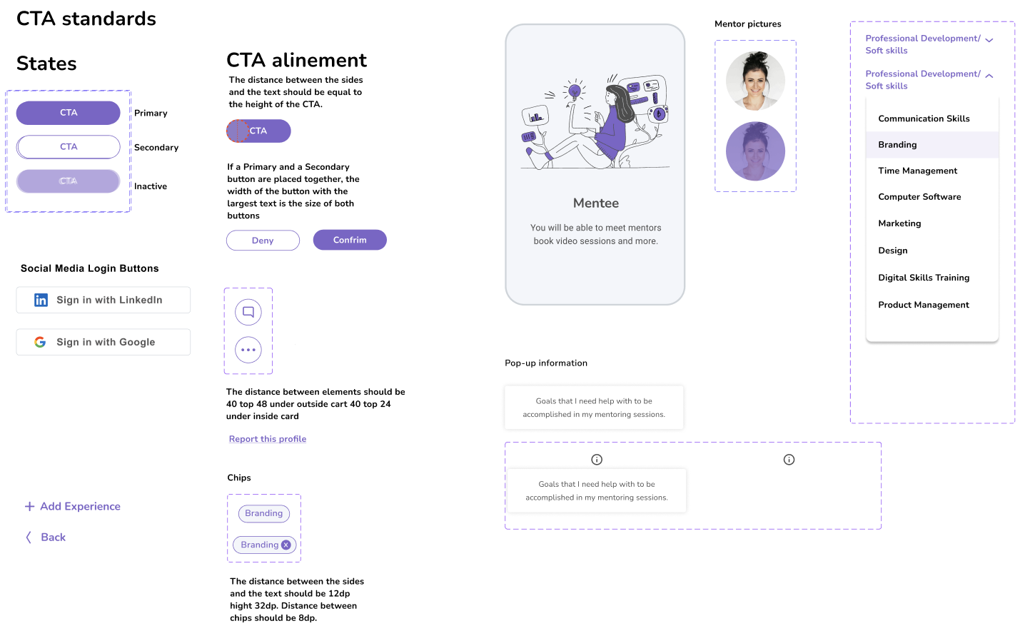
Design system
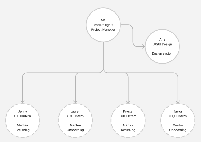
Design team restructuring
Once we had a good direction of the MVP’s must-haves and UI elements, I hired four UX Designers to assist us in building out the MVP’s 4 use cases.
Each intern was assigned a different use case while Ana managed the design system.
I oversaw all five designers, collaborated with our engineers as new ideas came up, and reported to the founder.
Design
Secondary research
Mentor motivations
In a study, hundreds of women reported that it isn’t because they aren’t willing to mentor; it’s that they are not being asked.
Additionally, The majority of women (75%) reported that the time it takes to mentor most affects their decision to accept mentorship.
Both
Men tend to seek and to offer mentoring more readily, and women more typically need to be found and encouraged.
Organizations are not providing the skills for mentorship (coaching, training, networking etc), formalize programs, provide support and training.
Mentee motivations
63% of women in a study reported that they have never had a formal mentor.
Mentees want a mentor who is proactive, a partner in accountability and consistent, rather than having a one-off meeting.
It’s important to build a relationship.
Use case user flows
With our MVP’s vision, the new designers and I worked together to figure out the user paths for the four user flows.
With the reasearch indicating mentees want a relationship with their mentor, we decided to introduce long-term booking options to better accomodate this need.
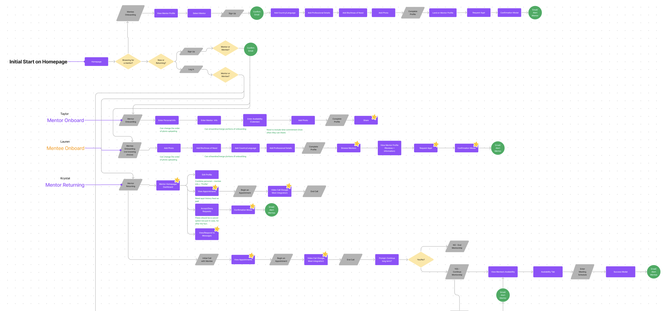
Mentor Onboarding
Goal: Get mentors to create a profile and fill it out as much as possible.
Why: Information such as skills, past job experience, and languages were all things mentees considered when selecting a mentor. It was important to encourage a complete profile so mentees can make an informed decision.
Mentee Returning
Goal: To get mentees to find to explore the platform and search mentors before requiring them to create an account. Mentees are only required to create and account or log in when they decide to book an appointment.
Why: Allowing the mentees to discover the possibilities offered by LevelUp before we ask them to do something increases the likelihood of them doing so.
High Fidelity Designs
Each user flow was turned into a high-fidelity proto type in order to conduct user testing.
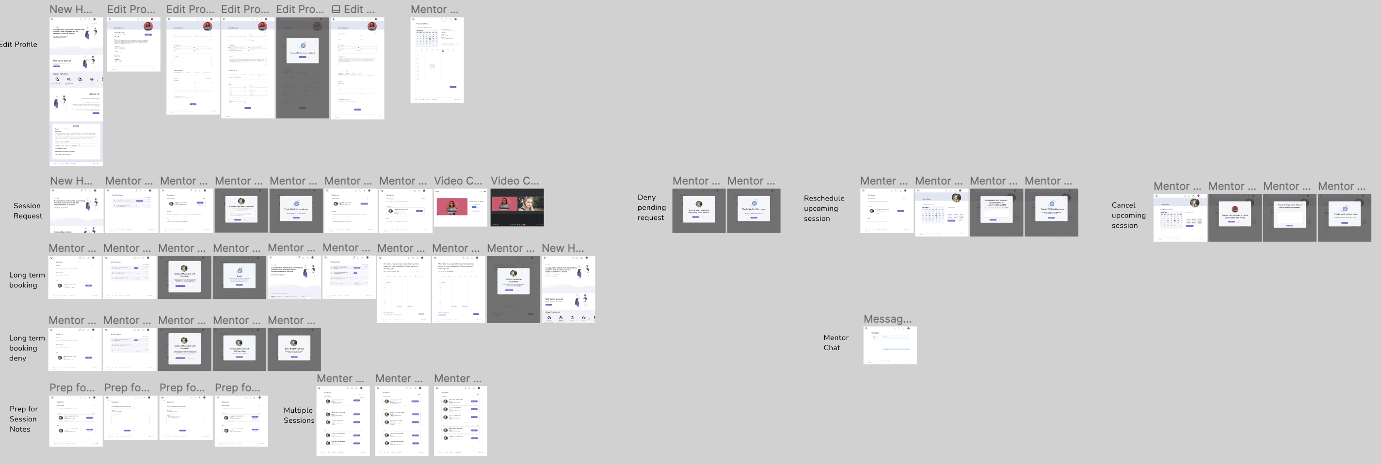
Mentor onboarding

Mentor returning
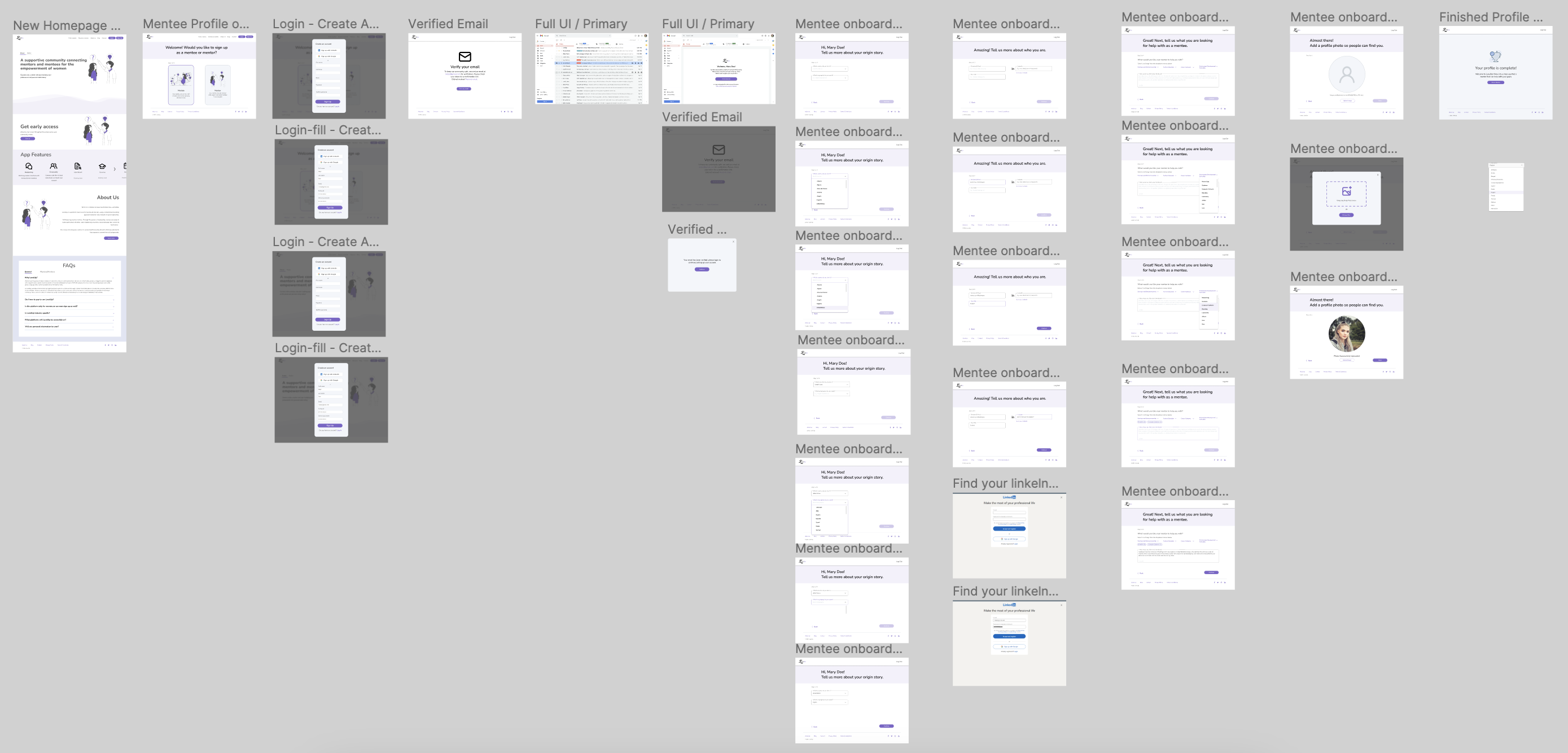
Mentee onboarding
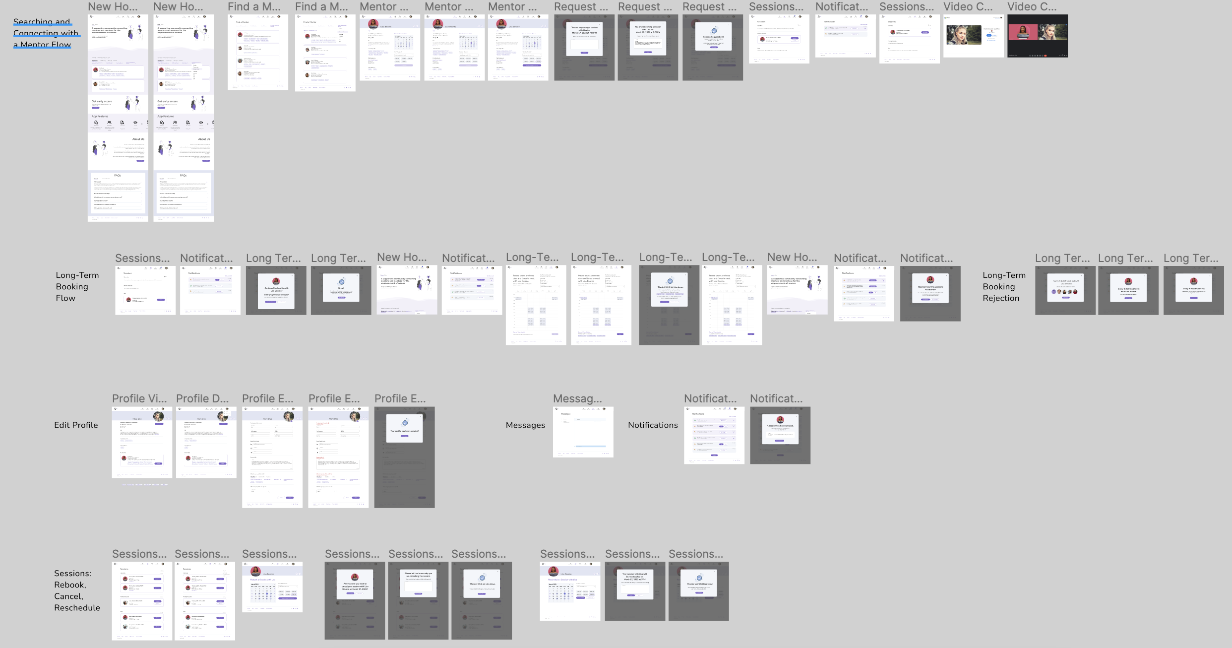
Mentee returning
Prototype Testing
The goal of prototype testing was to capture the testers overall impressions of the product; the good and the bad. Analyzing these impressions would guide us on what is working and what needs the most attention.
The prototype was tested, remotely and moderated, on 5 mentors and 5 mentees that met specific criteria.
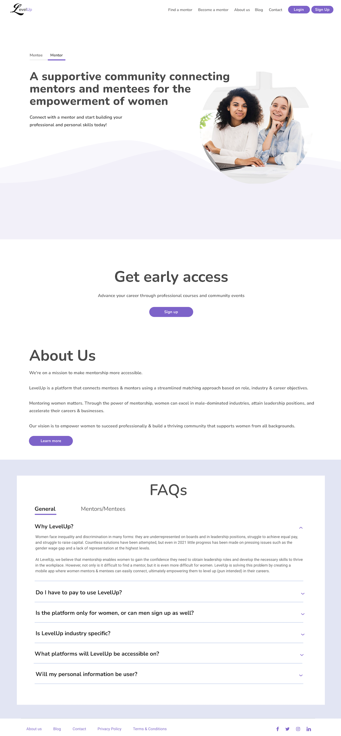
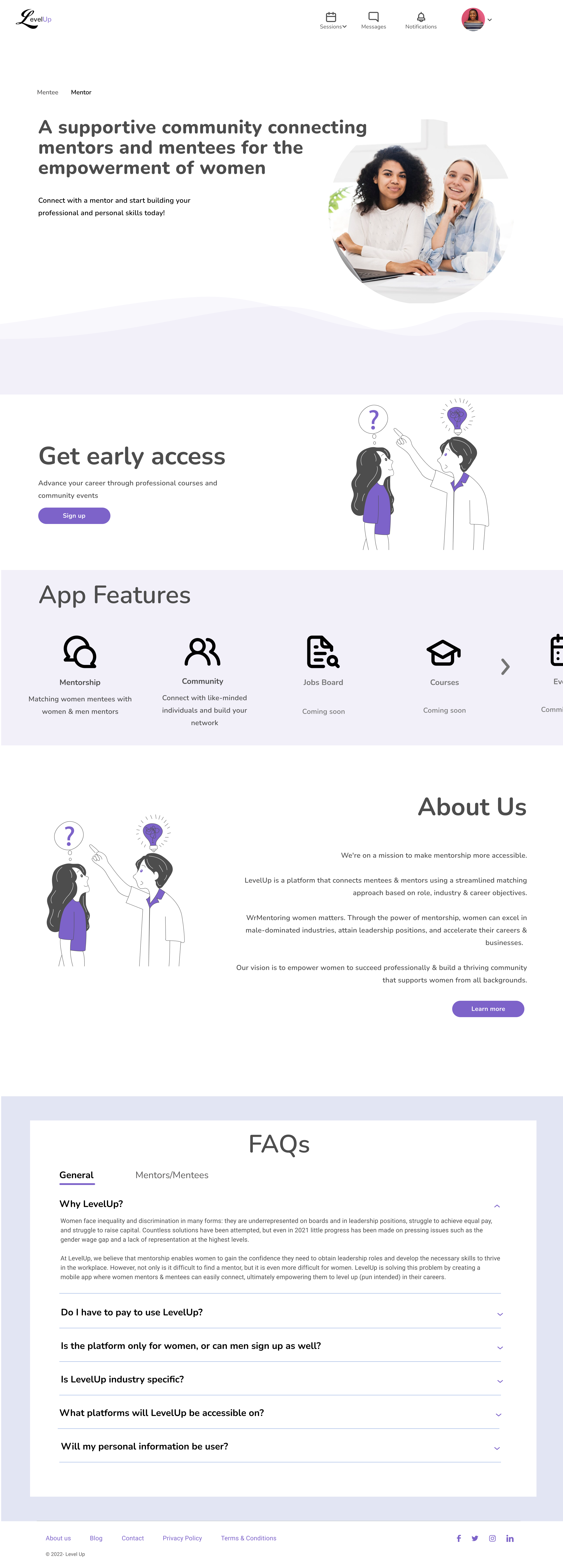
The Homepage
To get some direction for the marketing team, we asked both mentor and mentee testers what they’d like to see on the homepage to help educate themselves about LevelUp.
4 out of 5 noted that FAQs where the most important and necessary area.
All understood the mission and purpose of LevelUp based on the homepage.

Mentor Onboarding
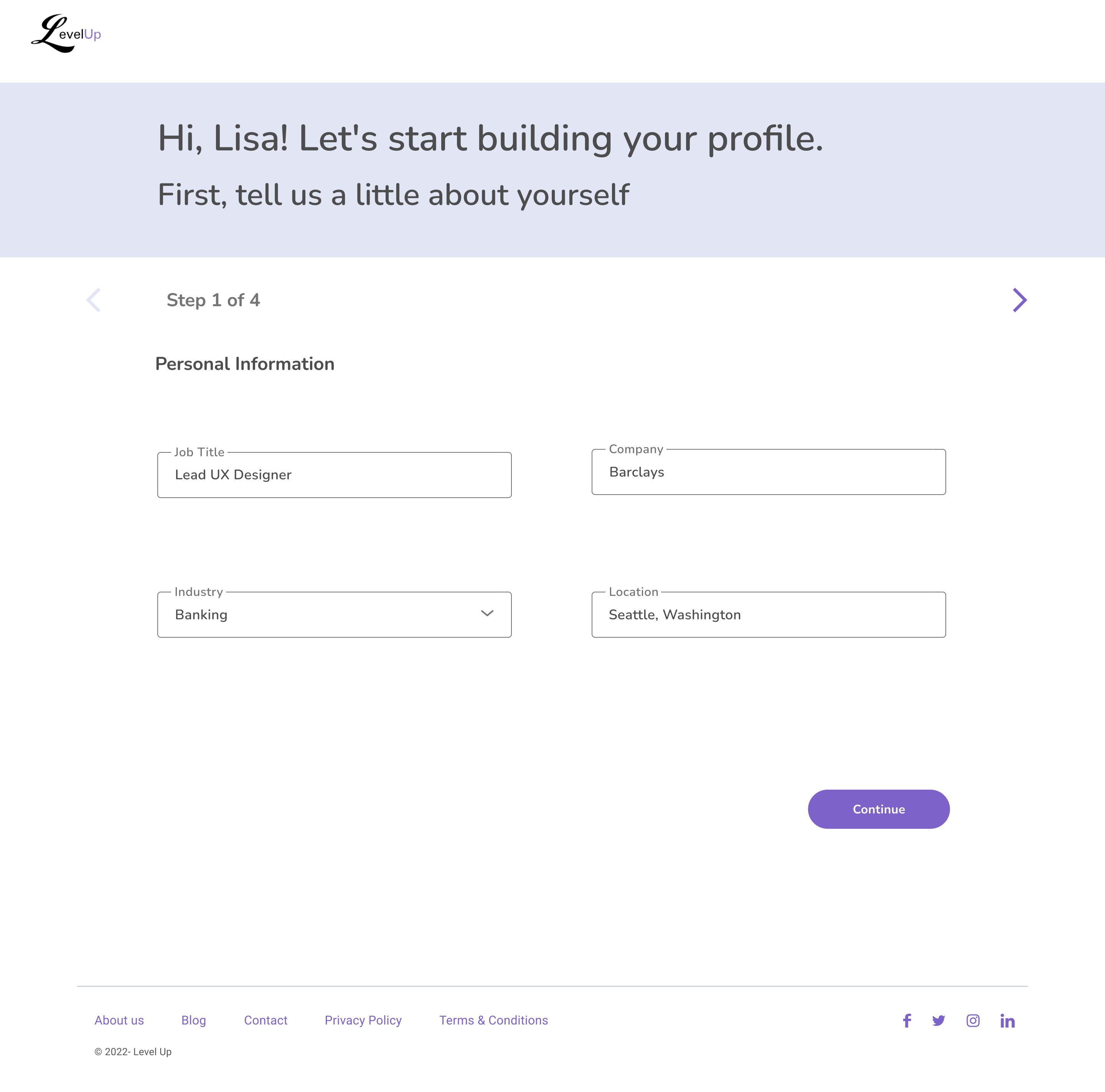
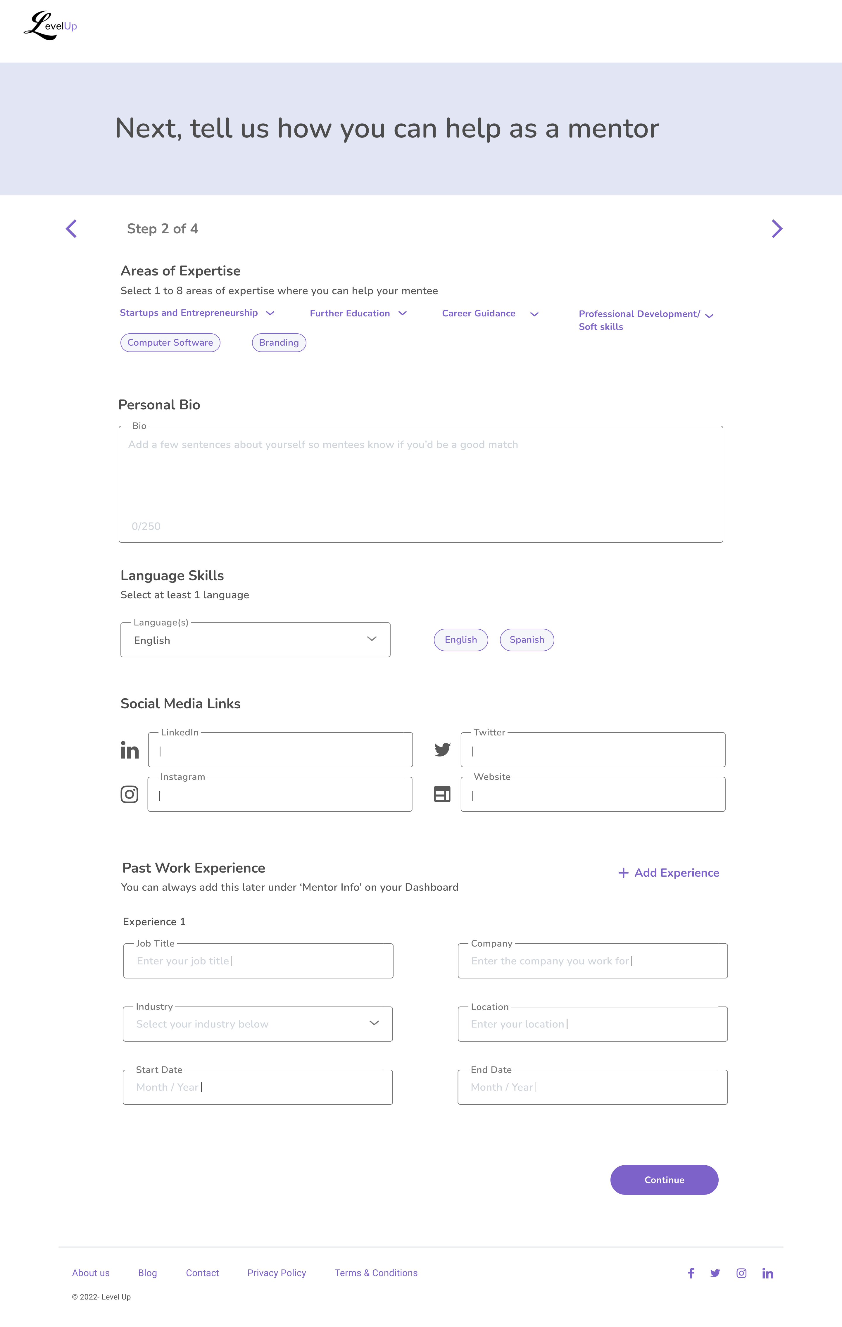
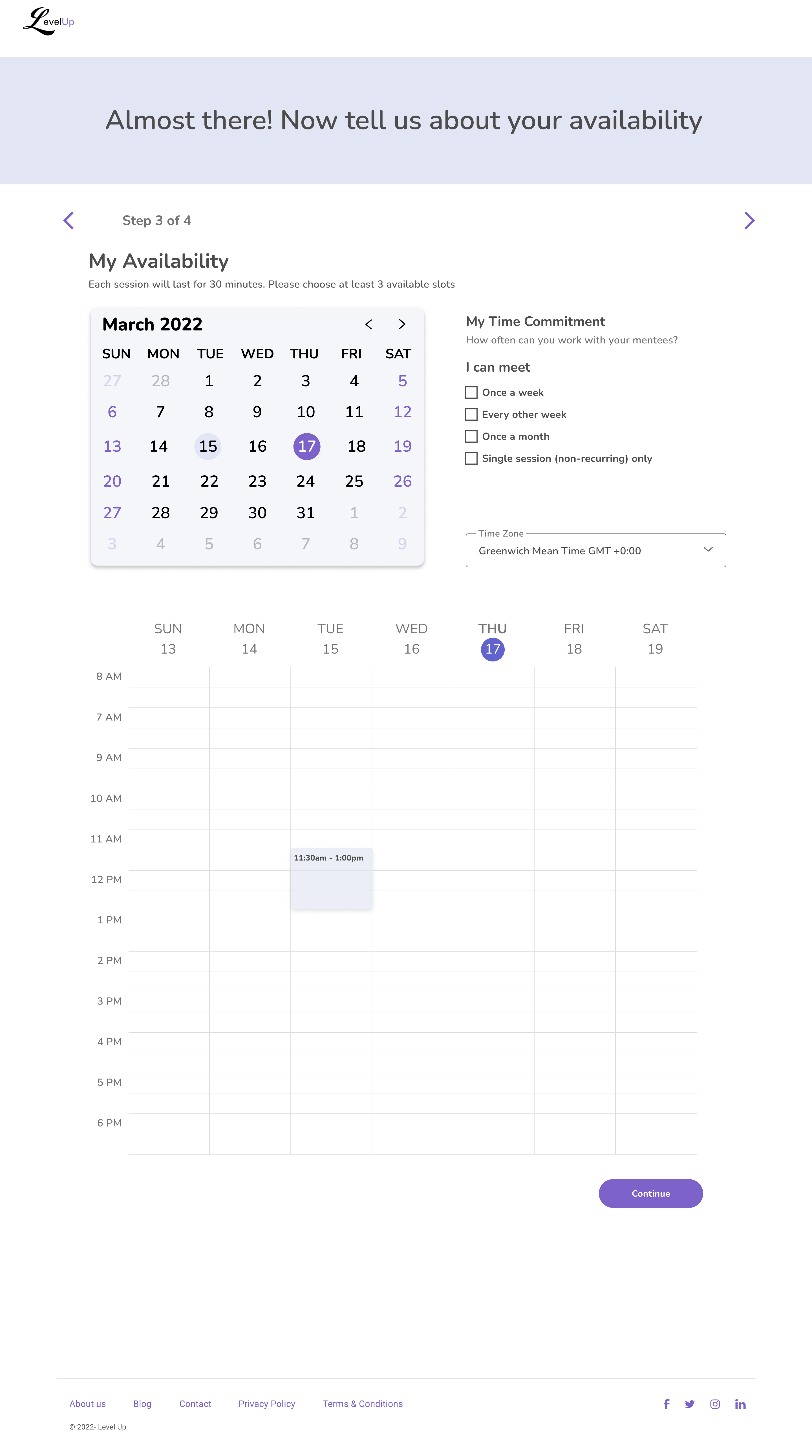
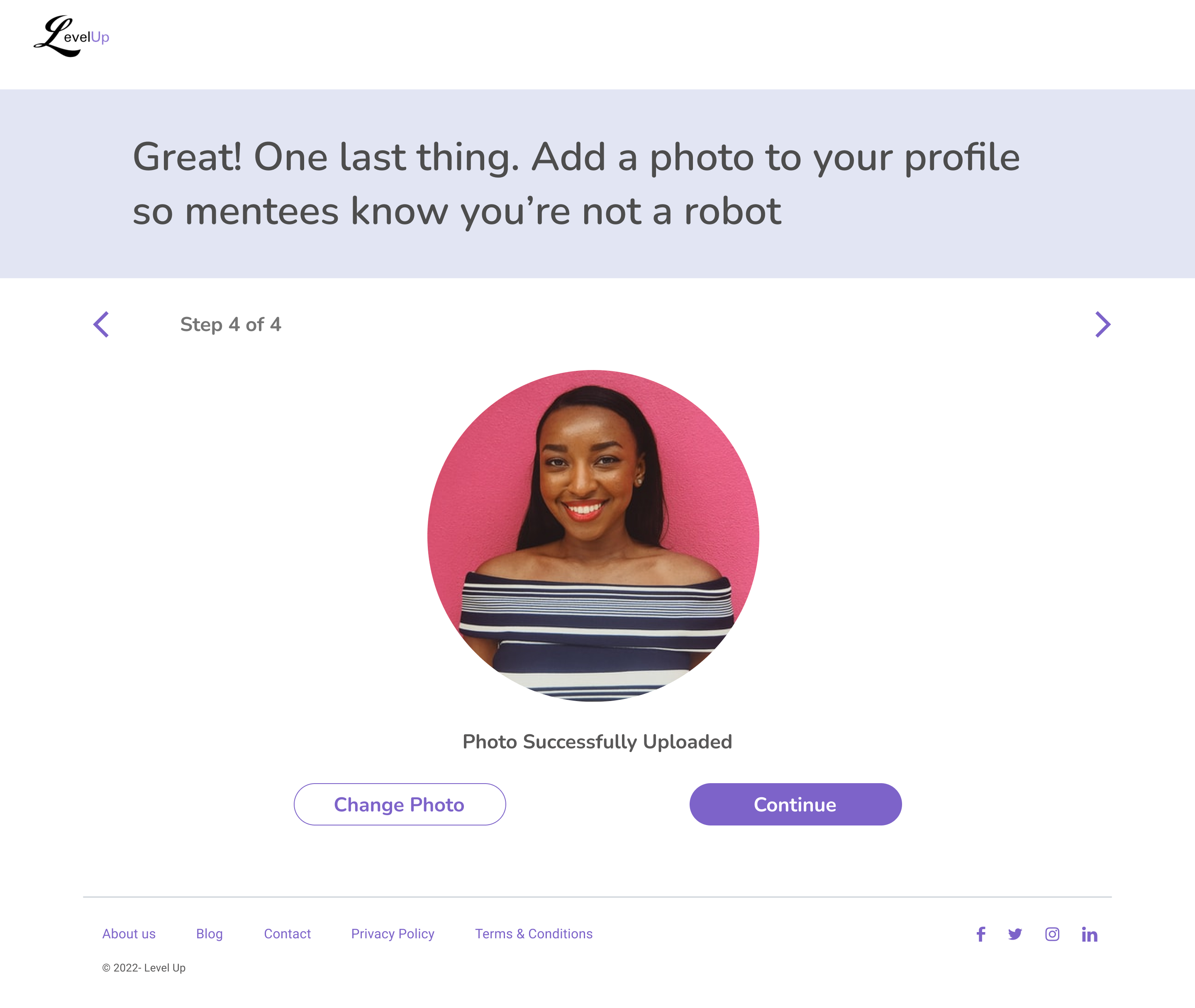
Testers, overall, had positive reaction to the mentor onboarding experience, calling it easy and intuitive.
3/5 testers commented that they appriciated the Past Work Experience section being optional for onboarding. They know that they can fill it out later once their profile is live.
Mentor Onboarding
3/5 testors want an easy way to sync their personal calenders to LevelUp to avoid another tedious task.
4/5 testers prefer a publicly visible profile for all users, citing the importance of showcasing mentoring opportunities. They felt restricted profiles could discourage potential mentees from signing up.
Mentor Returning
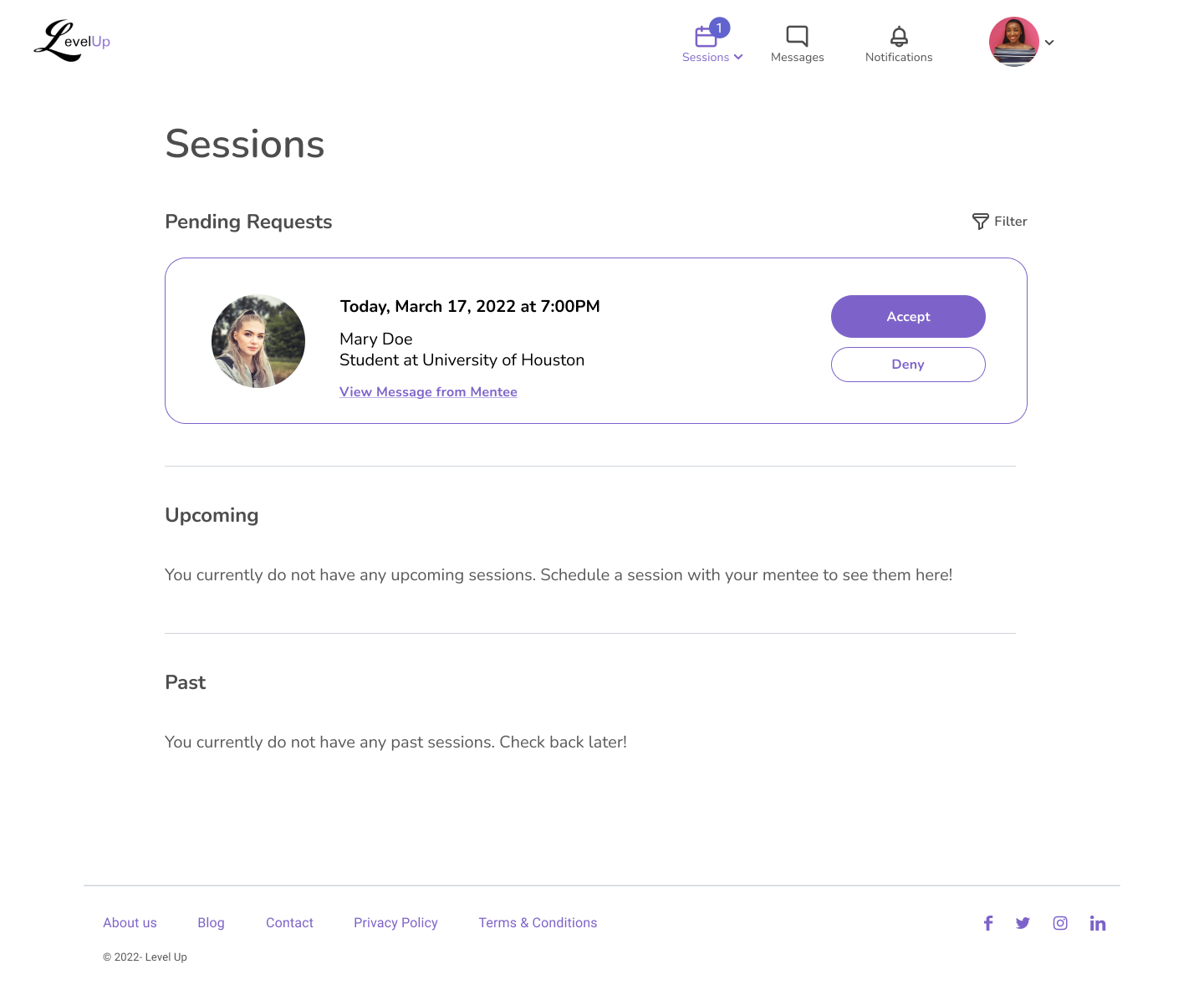
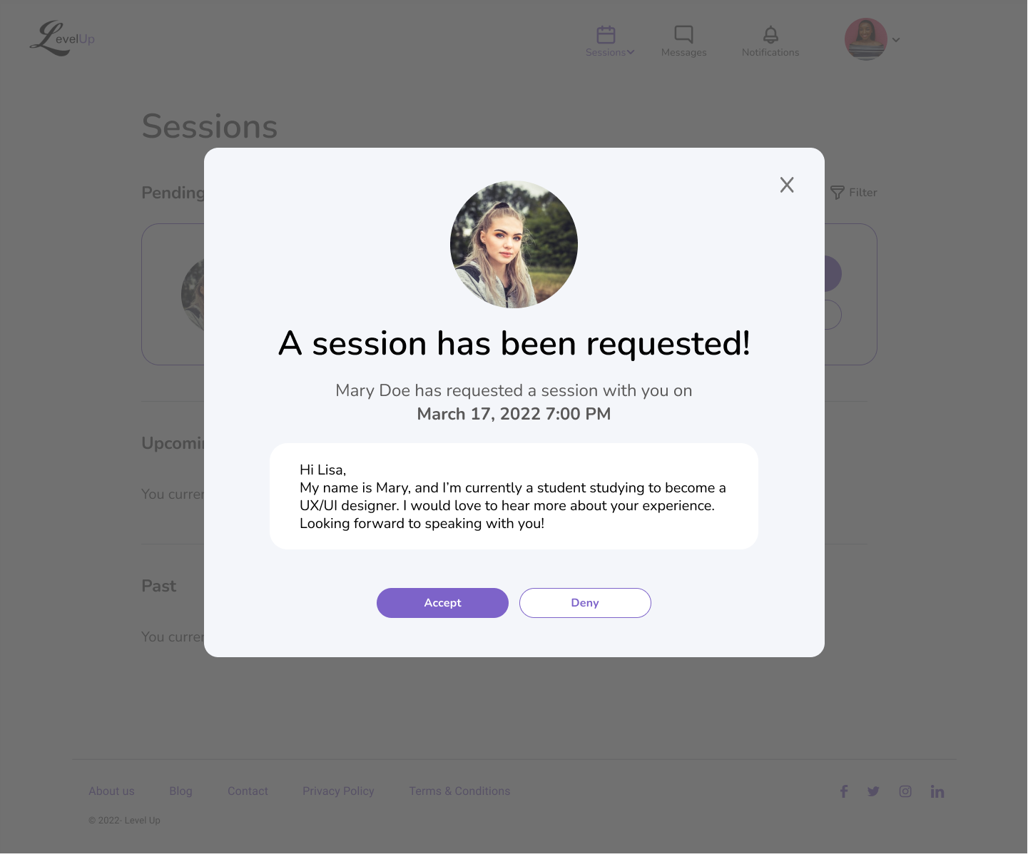
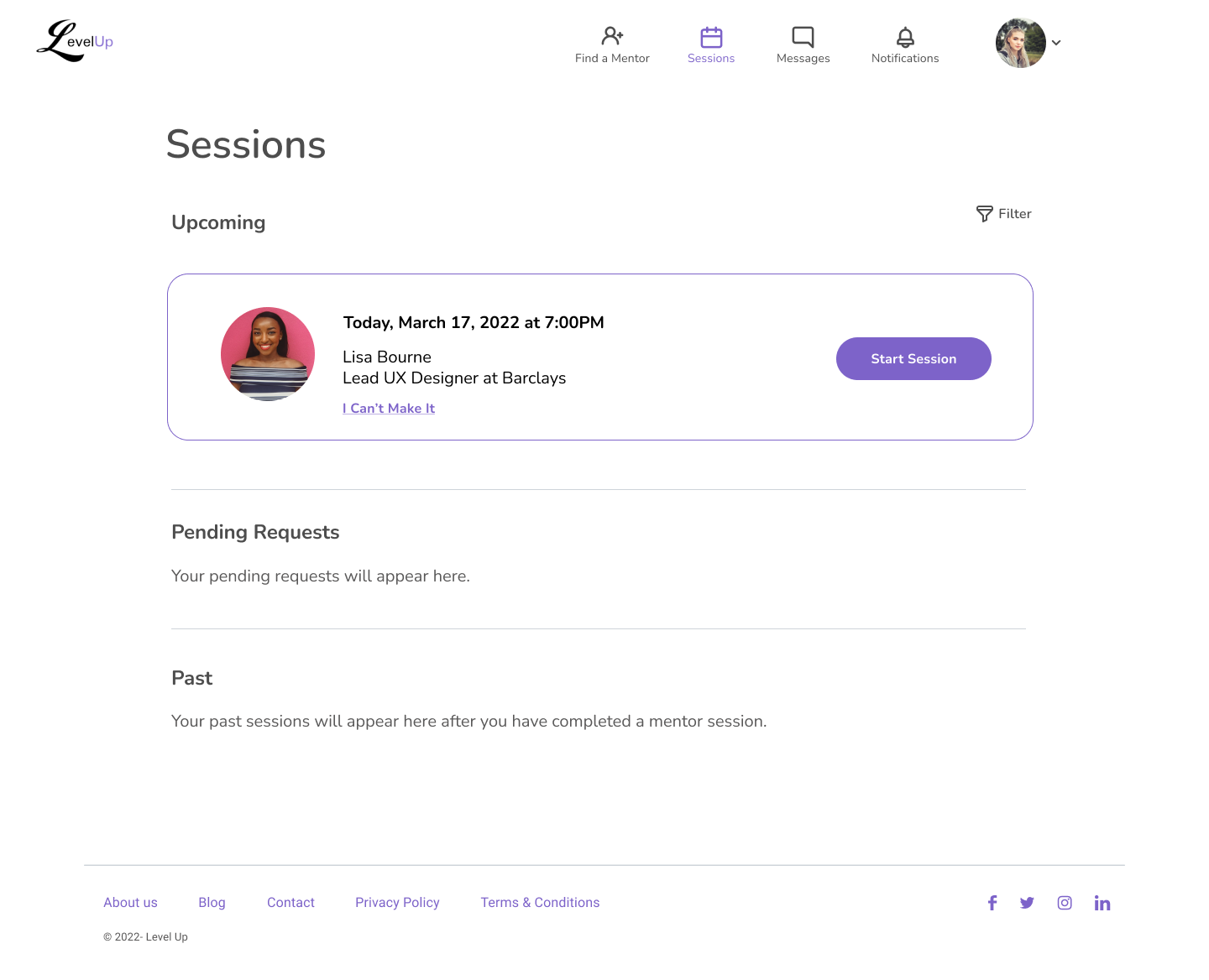
5 out of 5 users had no issues accepting and beginning a session with a mentee, they found it easy and intuitive.
Mentor Returning
Most testers didn’t really know what to do on the dashboard after finishing a video session.
2 testers didn’t understand why the mentor would rebook a session, they felt it was the mentee’s responsibility to follow up.
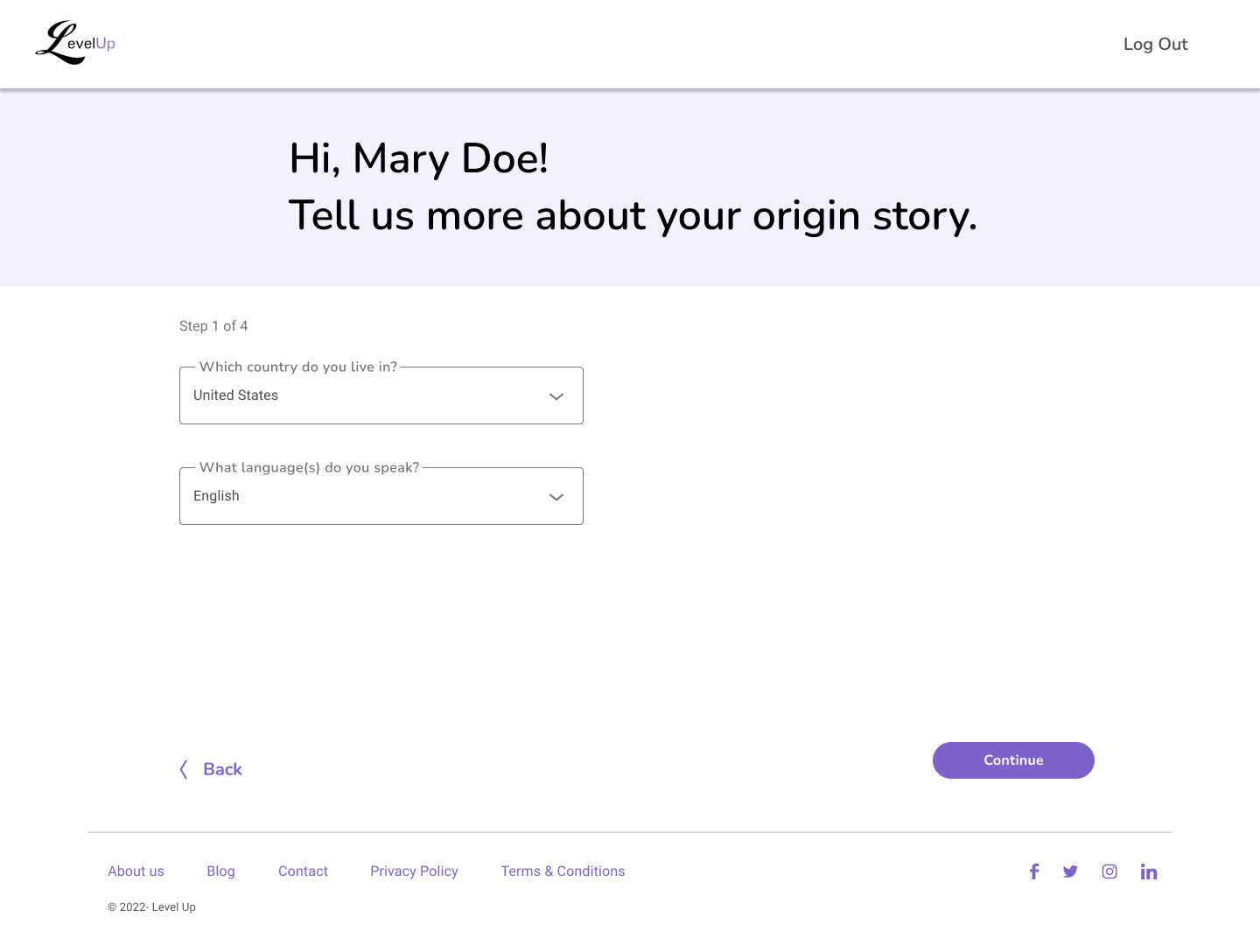
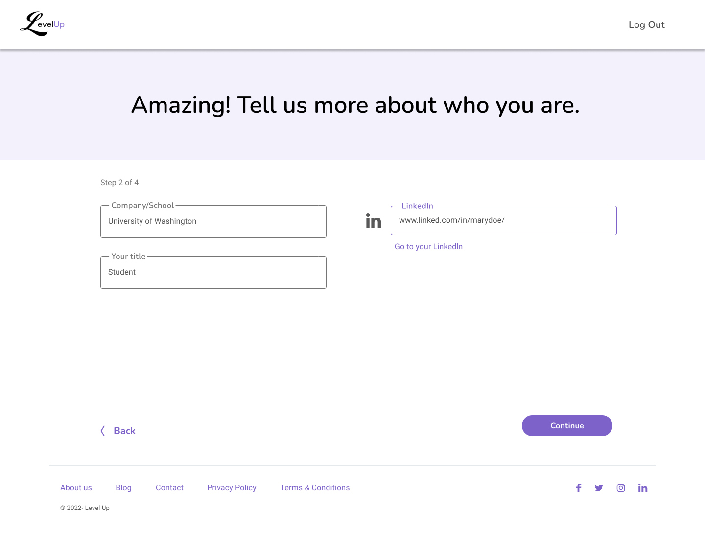
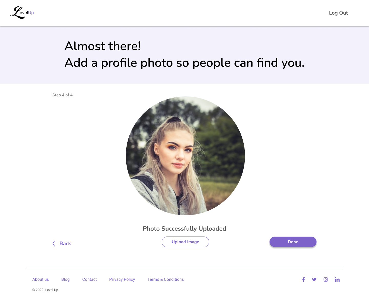
Mentee Onboarding
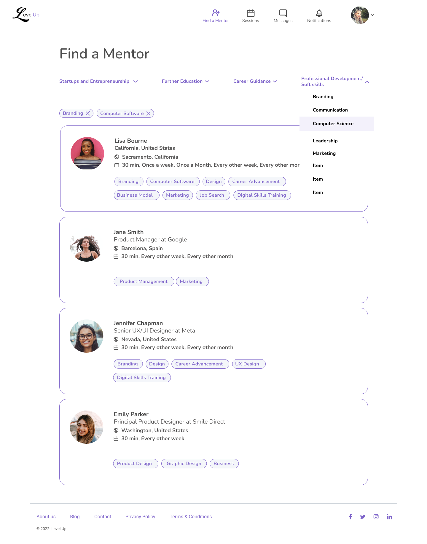
When the testers were instructed to find a LevelUp mentor, 4 out of 5 of users clicked “Find a Mentor” to initiate the sign-up process, expressing no issues with the making an account.
All testers completed onboarding easily and had little friction.
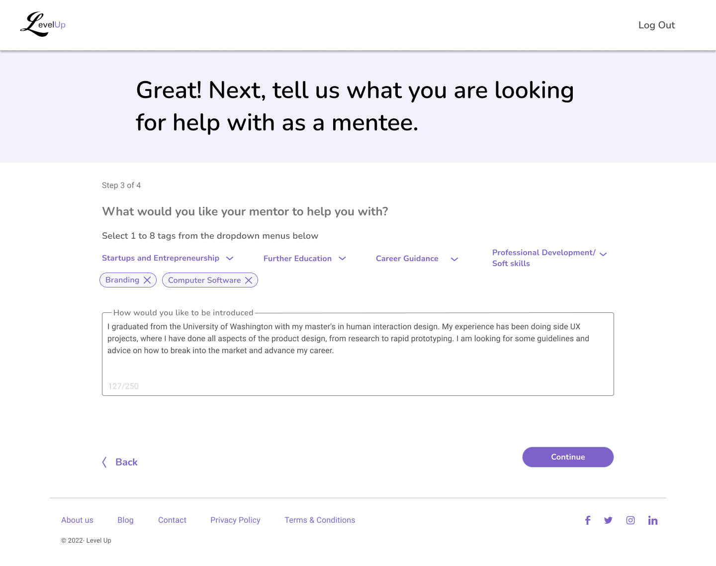
Mentee Onboarding
All testers weren’t really sure what to write for their bio.
Mentee Returning
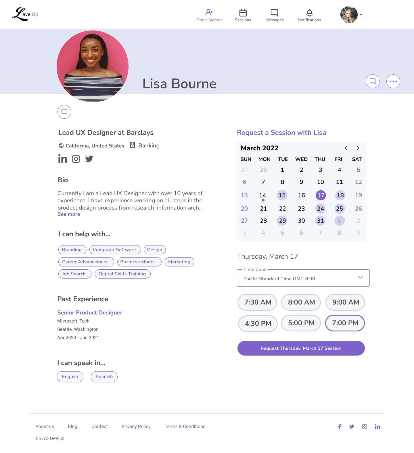
5 out of 5 found starting a video call session easy.
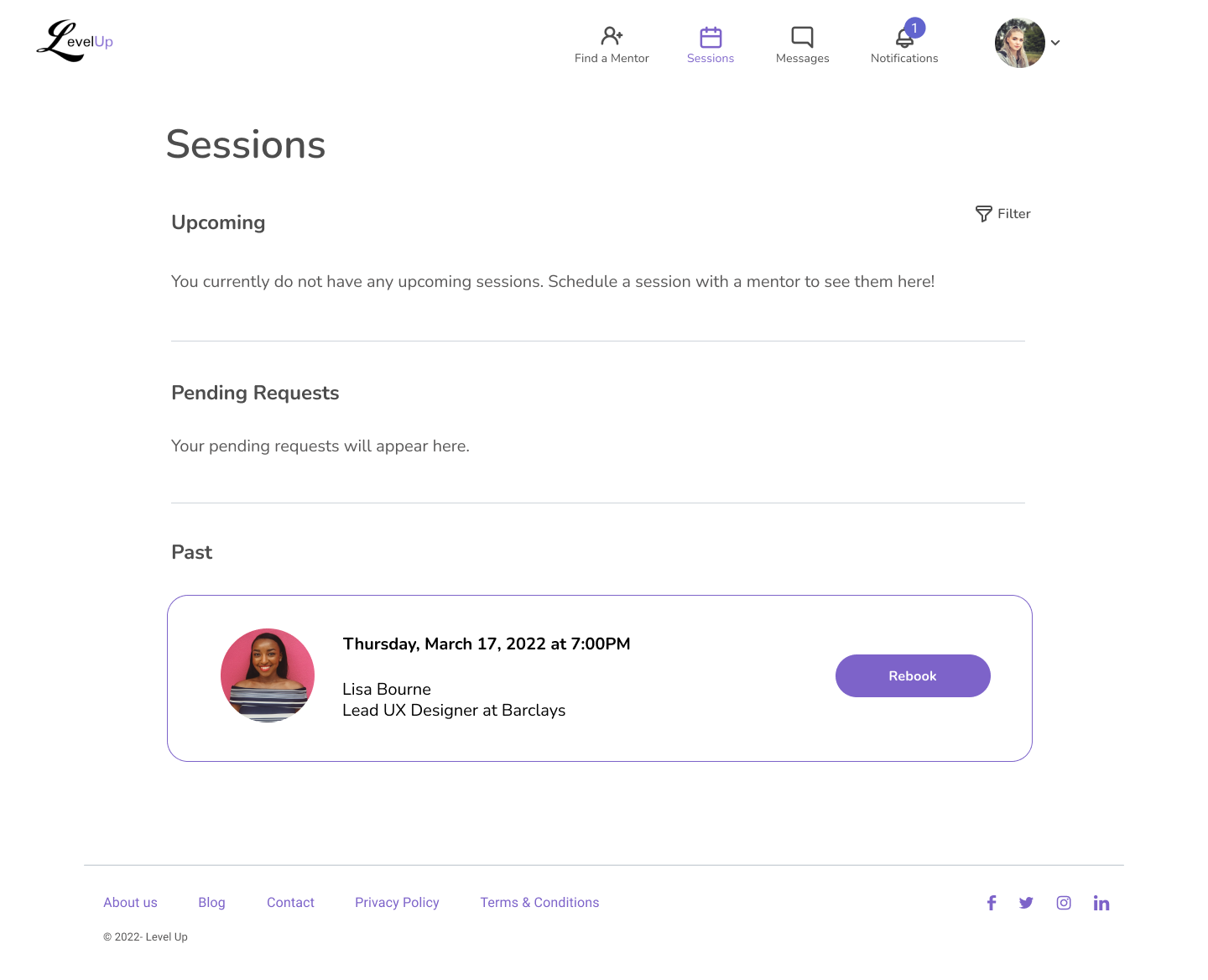
Mentee Returning
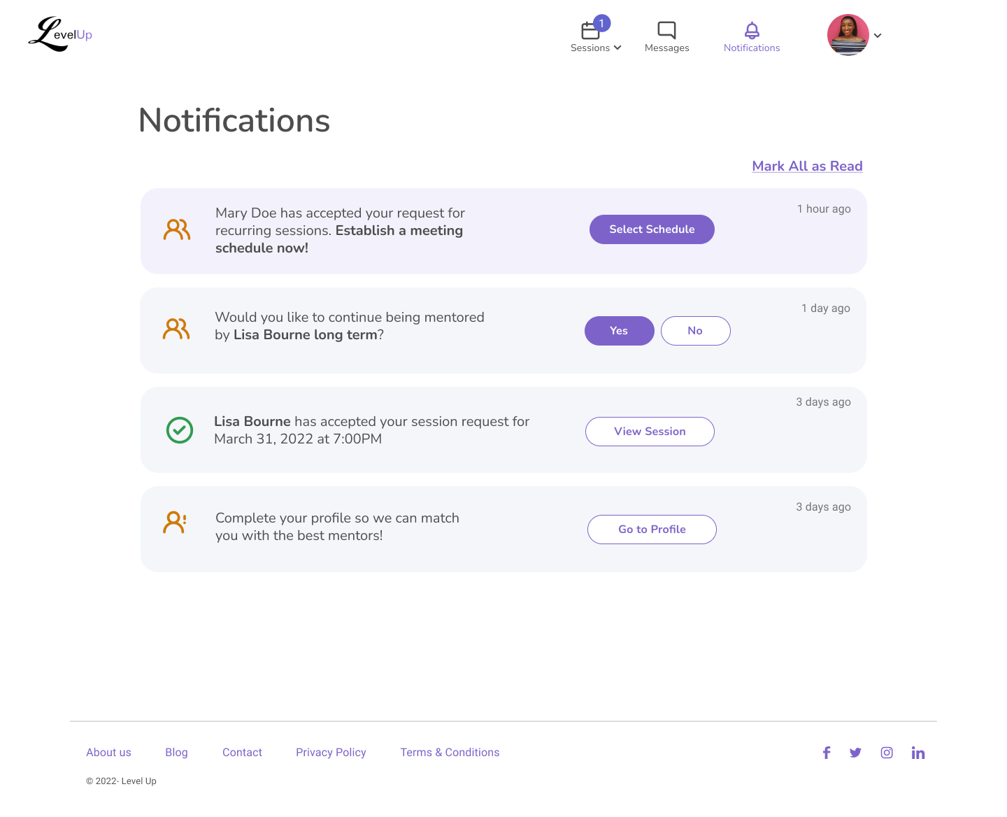
3/5 were confused on what to do after their session ended. All were nudged to check notifications for prompt.
Rejection
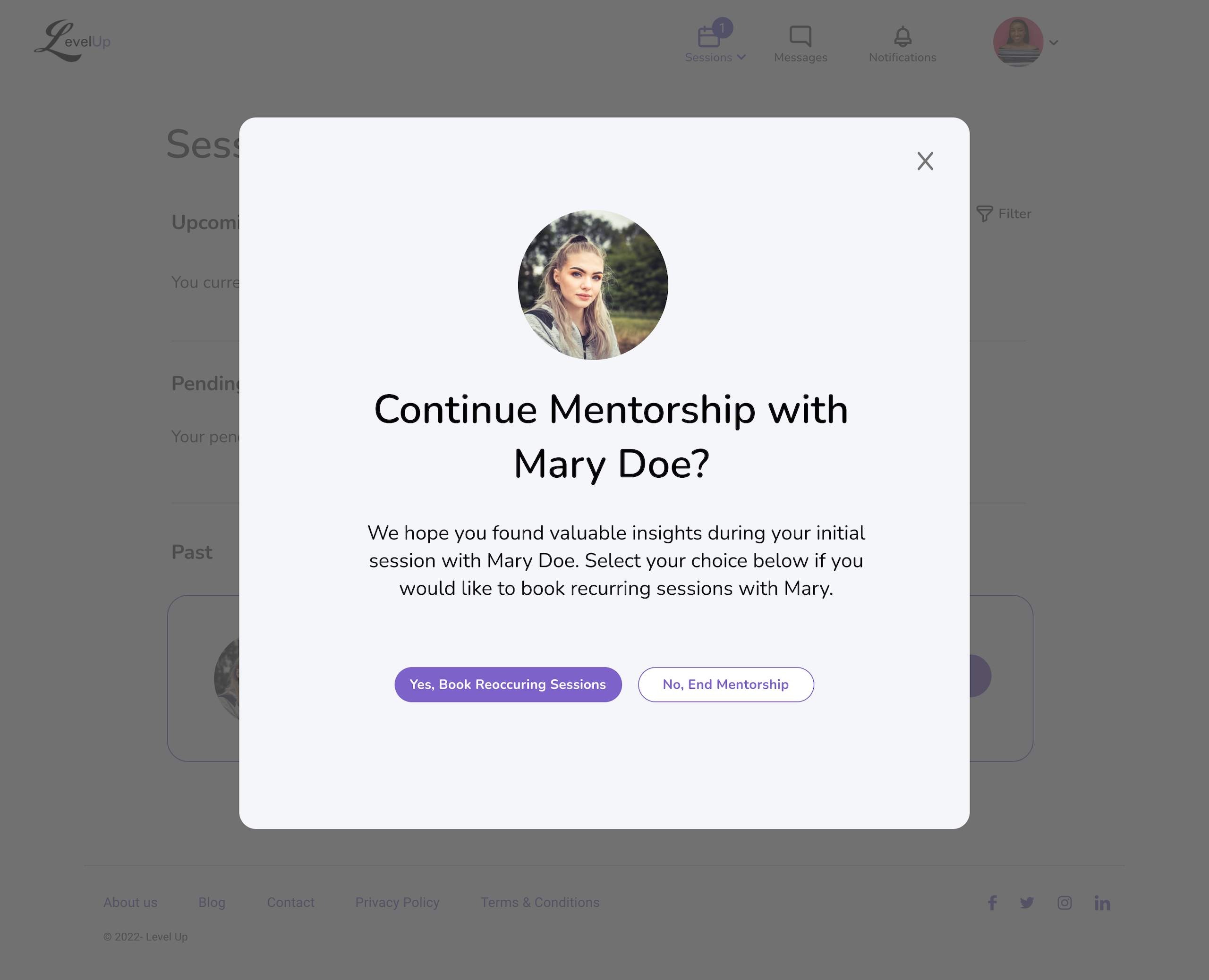
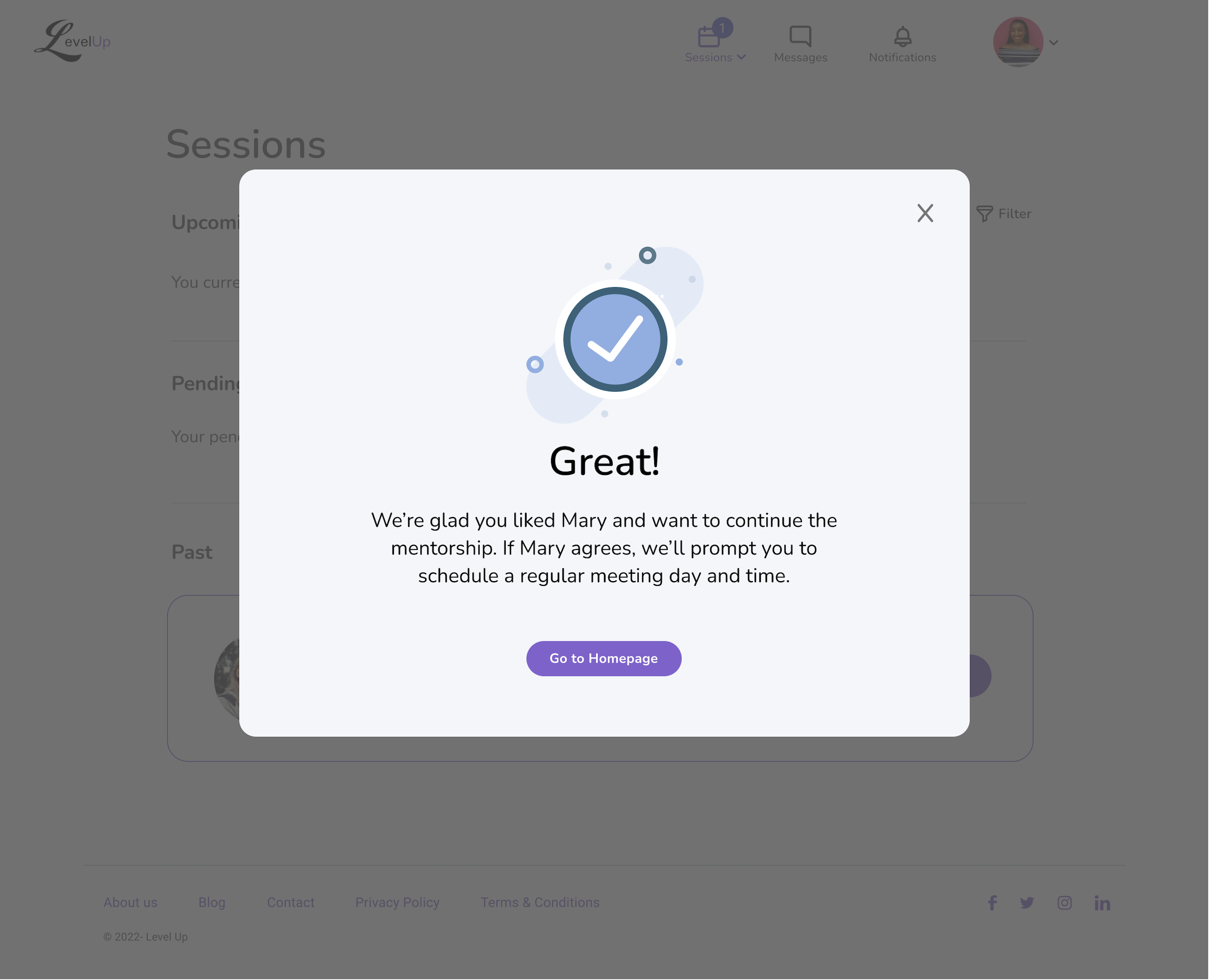
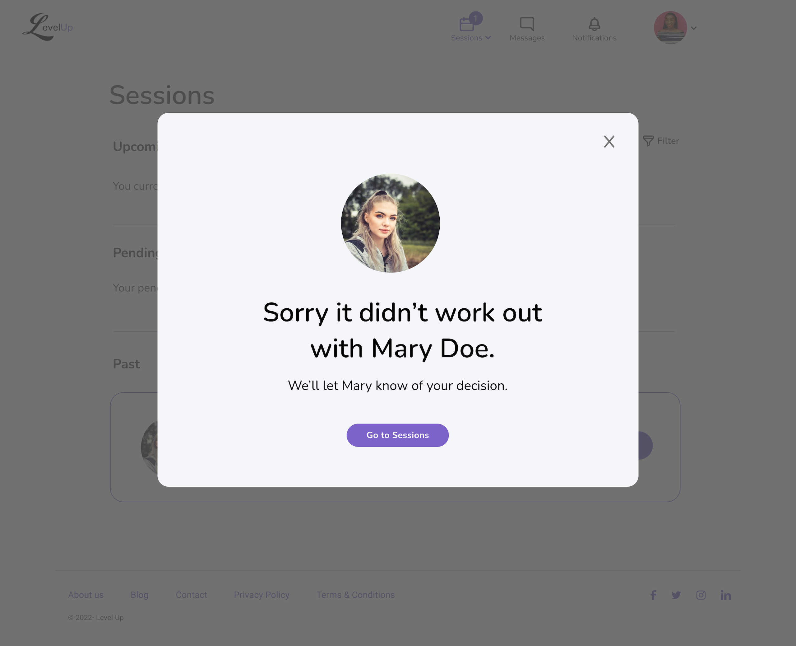
What if a mentor or mentee no longer wants to work with the other?
Most users liked the concept of rejection, but did not like the brief popup modal.
All 10 testers users would like the ability to write or read a note explaining why they were rejecting or being rejected.
Reactions to new UI
Overall, reactions to the homepage and modernized visuals were positive. Some didn’t resonate with the graphics because they feel photos are more human.
“The design is clean and I love the colors.”
Not creepy!
CSAT Score
A post-testing CSAT survey was given to participants and 7 of 10 testers submitted their input.
What is the likelihood that you would use LevelUp on a scale of 1 to 5 (5 = very likely).
5/7 selected a 5
One, I’m excited for a mentor/mentee platform. Two, the user testing I just did as a mentor made the onboarding experience pretty seamless and easy. Most mentors probably have little to no time to go through the set up of an account profile and there weren’t a lot of fields to fill, but rather drop downs to help nudge you forward. That makes the decision making process much easier, and if the onboarding was easy, then it leads me to think the mentor/mentee relationship should be as well.
1/7 selected a 4
I was previously in a women’s mentoring circle and enjoyed the experience. I think women should support each other. In my field, engineering, it is still a male dominated world.
1/7 selected a 3
I would consider using LevelUp as a mentor, but would need more time to research if i want to use it as a mentee (i.e. it would be nice to showcase some highlighted mentees on the home page as an advertising method to bring people in, or to display the company names of mentors that are on LevelUp).
Ideating round 2
With our second round of user testing, Ana and I took the time to organize all of the feedback and decide what to tackle first.


While we identified many areas of improvement, below are the key areas we focused on first.
Mentor updates
Make mentor profiles public.
Optimizing what steps a mentor should take after a call.
Letting the mentor explain their rejection.
Both
Advise the marketing team to deliver copy that explains how LevelUp works.
The homepage should be used for education.
Mentee Updates
Break up the “bio” into bite-sized questions to give guidance on what to write.
Optimize the journey after ending a mentor call so that mentees know what options they can take.
Make rejection necessary only when a mentor does not want to work with a mentee longterm and encourage the mentor to write a reason why.
Final thoughts
With the testing results and the bulk of the MVP built, designs were passed to our engineering team for developement.