Prepaid to Postpaid Migration Landing Page
I designed the landing page for Verizon’s first digital experience that migrates prepaid customers postpaid plans.
Team
Me + Experience managers
Role
Lead designer for the landing page.
Duration
4 months from concept to final pass off
Business Goals
Why should we build a digital experience?
Prepaid customers port out of Verizon Prepaid brands yearly
In lost revenue monthly due to port-outs.
Verizon prepaid customers are migrating to Postpaid plans per month
Verizon prepaid customers are only able to migrate to postpaid via telesales or at a Verizon store.
Design Challenge
How might we build a digital first experience that offers the customer support given by telesales and store employees with the following parameters?
My Verizon App only
My Verizon App users tend to be the biggest “fans” of Verizon so we wanted to target Prepaid users who activly shop our brand.
Single offer
Since this customer is offer-driven, the MVP would start with one offer – a Bill Incentive Credit (BIC) which could result in a new phone at no cost.
Single line accounts only
This experience is being built on assisted channel architecture and migrating two lines at once was never implemented.
Entry points
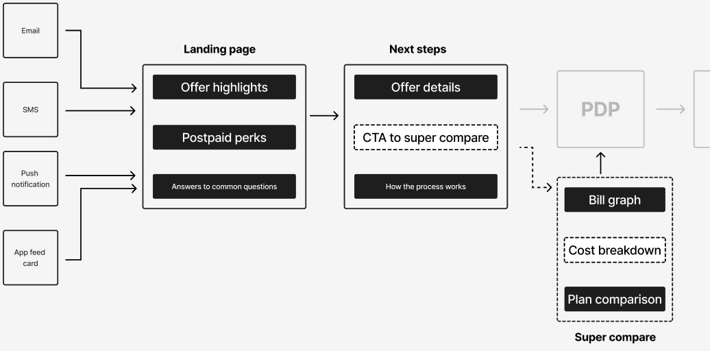
The customer would discover this offer by the following: email, sms, push notification, or a feedcard.
Foundational Research
To understand why Verizon prepaid customers migrating are postpaid plans our research team conducted user interviews which lead to 2 key findings.
Promos and device payment plans incentivized switching.
“We got a great bundle discount, as well as a teacher discount. We’re saving about $40 per month.”
“My biggest issue with my old [prepaid] plan was constantly monitoring my data usage. I hate paying overages.”
Financial, then plan details were the most important information participants needed to see before switching.
“Would I loose my autopay discount?”
“Would the price be more than I’m paying now? Can it fit in my budget? I want to make a change but I fear I wouldn’t be able to afford it.”
Ideation
Based on the user interviews, various features and “must-haves” were brainstormed.
Answers to common questions
These answers were determined to be the most common questions customers asked about switching.
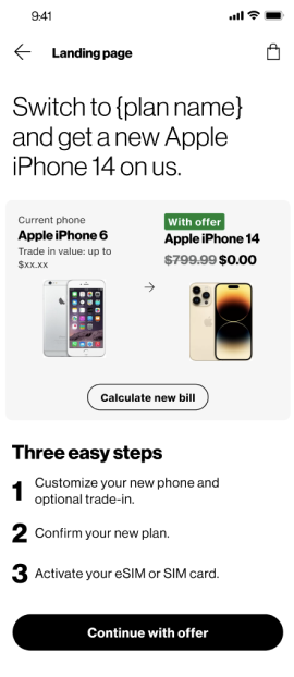

A bill calculator
Since interview participants stated that the most important information to see before switching was financial details, we believed a bill calculator would be a valuable tool to compare their current and future monthly costs.


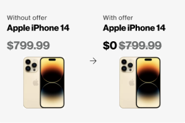
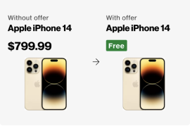
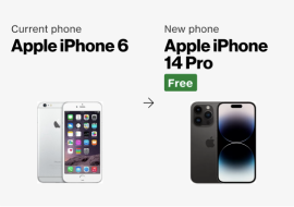
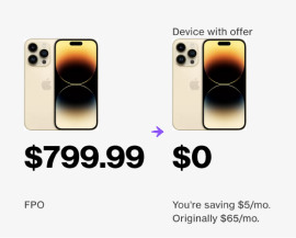
Visuals for the BIC offer
If a Verizon prepaid customer wants a new phone, they must pay the full cost upfront. The visualizations explored below highlight the value of this offer.


User flow
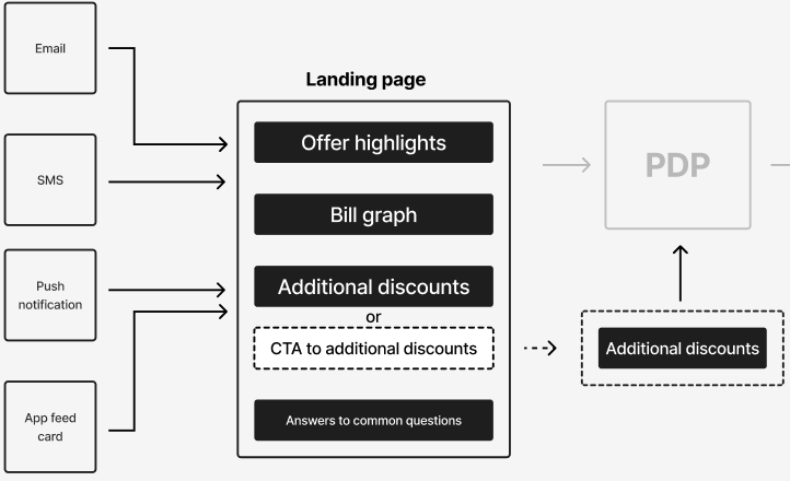
Once we had a working idea of how we wanted to merchandise the offer, we integrated these ideas into our prospect sales flow.
User testing
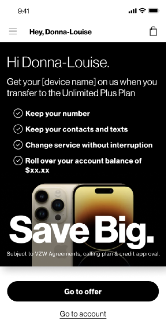
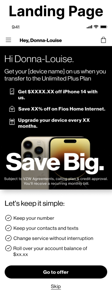
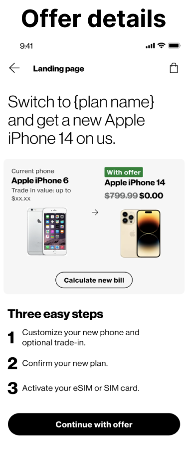
Since this experience is brand new, I ran a spot test on the below landing pages to get first impressions and rapid feedback.


User test findings
Testers loved the extra perks.
In prepaid, customers loose out on phone financing options and special perks like a Fios discount.
Testers misunderstood the overall offer.
The misunderstanding ranged from users being confused about how the offer works with other discounts to not comprehending that they were switching to postpaid.
Pricing transparency was appreciated but not welcome.
Testers like seeing how their bill would change but did not like seeing how high their next bill could be.
Steps for the second iteration
Highlight more perks and discounts but in less words.
Be more clear about what the offer actually is; a migration to postpaid with a BIC offer.
Iteration 2
The feedback from the first user test was incorporated into two different versions, which we later A/B tested.
Updated user flow
The elements on the first iteration (below left) were streamlined and condensed into one page (below right).
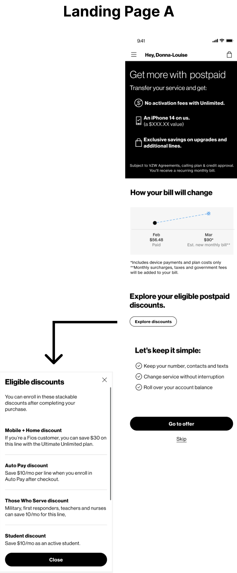
Since users loved seeing how they could save and disliked how their bill could go up, we incorporated other discounts that could be applied to their new postpaid bill.

A/B tested prototypes
The discounts we incorportated were put into two different designs; one that shows all the information upfront and one that gives the user the choice to read more.

A/B test results
Option B wins
Testers did not like having to dig for extra information – they wanted the discounts “front and center” with fewer clicks.
The bill calculator was not well received.
While some testers were able to do the math with the postpaid discounts, most testers simply did not like seeing their bill go up.
Offer detail comprehension improved.
All testers understood that this offer would migrate them to postpaid but some testers wondered if they could customize their offer (as in skip the phone and only change their plan).
Steps for the third iteration
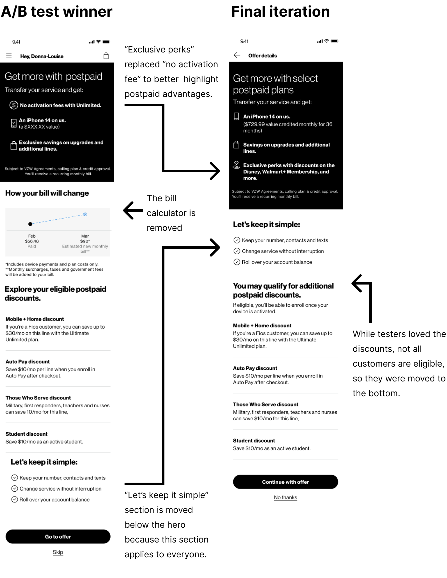
1. Remove the bill calculator. This feature not only caused negative reactions but, behind the scenes, it was determined that the bill calculator does not give the full picture of the monthly bill and it would be technically difficult to scale as this experience scales.
2. Keep pushing the offers and benefits of postpaid.
Final iteration
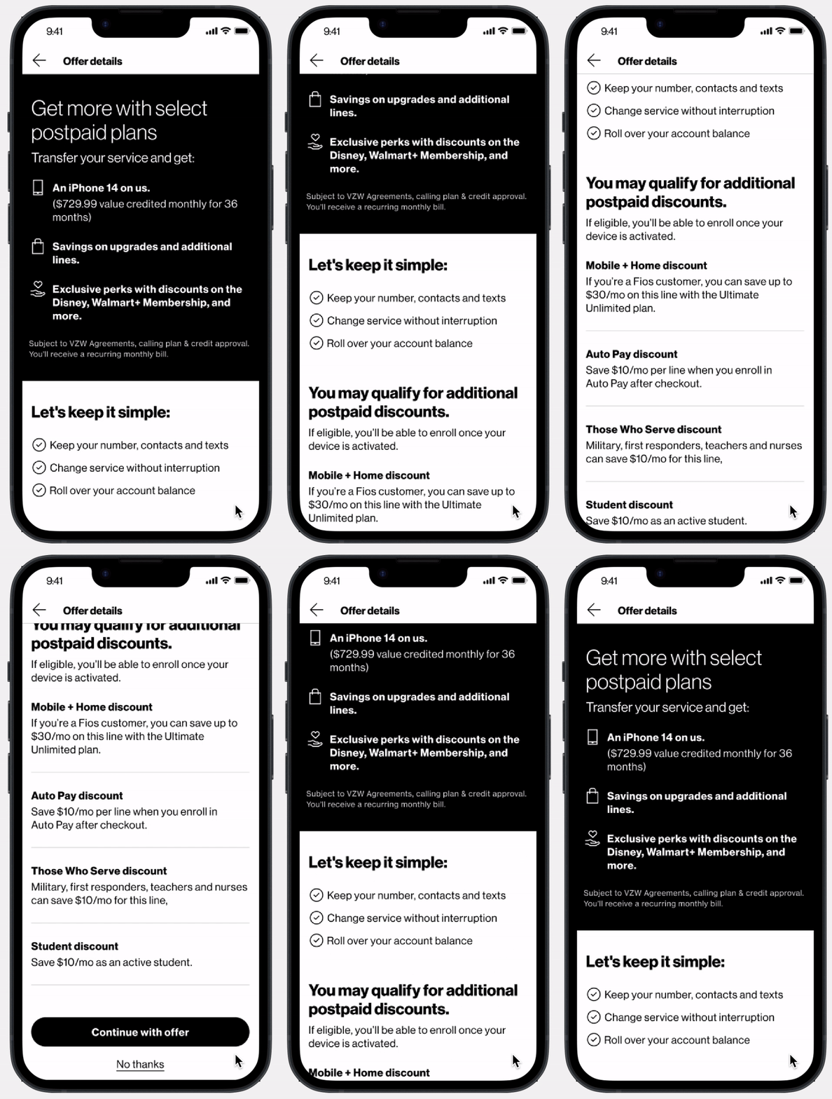
For the final iteration, the A/B test findings, CMI research, and technical limitations were implimented (described below).
